

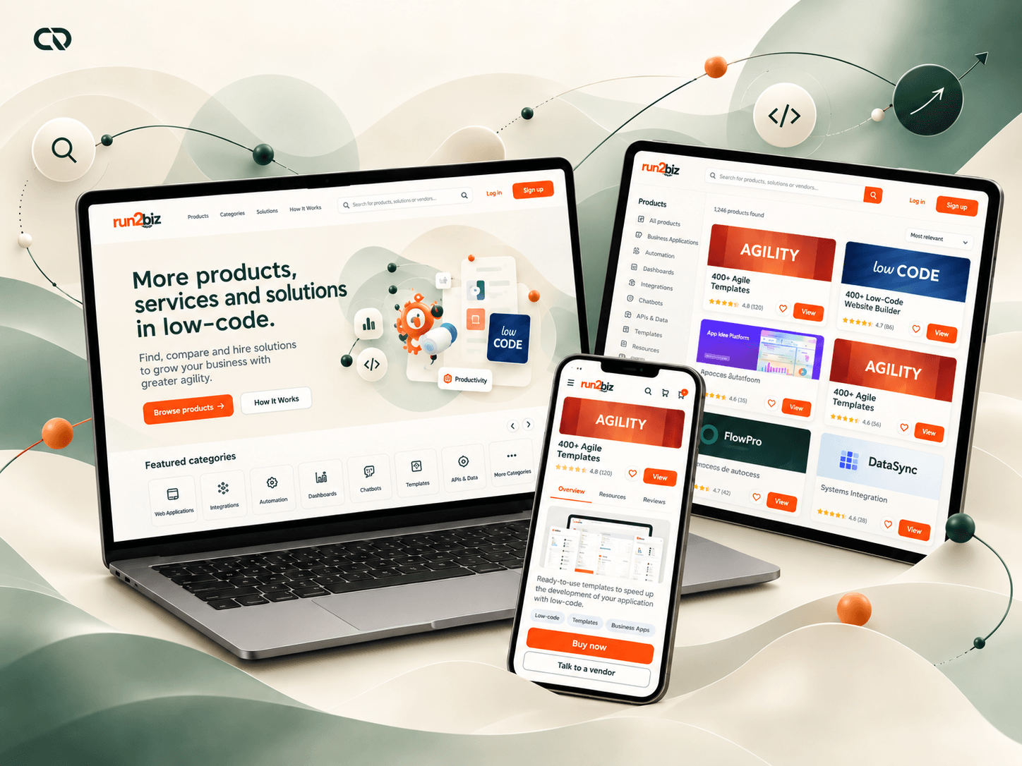
Turning technical solutions into understandable choices.
A company looking for a low-code solution needs to understand what it does, assess whether it meets its needs and know how to start using it. Developers, in turn, need to present, publish and manage their products. At Run2Biz, I worked on building the experience that connected these interests.
The challenge spanned public pages, the catalog, purchasing, publishing and management. Working with the Product Manager and the technology team, I structured flows, interfaces and a shared component foundation based on the existing visual identity.
My work covered Product Design, information architecture, UX/UI, UX writing, prototyping, a design system and documentation. It connected business decisions with the information and actions people needed at each stage of their journey.
My contribution: shaping the marketplace into a product with clear paths to discover, evaluate, purchase, publish and track solutions.
The marketplace had to work for sellers and buyers alike.

Run2Biz already had a visual identity and a proposition to connect low-code developers with companies and users. The digital experience behind that relationship still needed to be built: how products would be presented, evaluated, purchased and managed.
The work considered four reference profiles. Developers needed to publish and track their solutions. Technical buyers sought documentation and confidence to make a decision. Less technical users needed to understand the benefits. Administrators needed information and criteria to review the catalog.
These needs influenced both structure and language. A description useful to a developer could fall short for someone trying to understand the benefit. A commercial page, meanwhile, needed enough depth to support a technical evaluation.
The challenge was to organize these differences so that each person could find the information and next step appropriate to their task.
Understanding the questions before designing the answers.
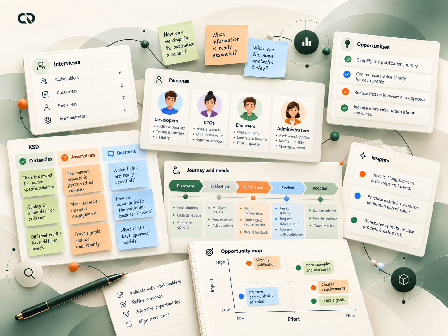
Through stakeholder conversations and analysis of the product's needs, we worked on defining the audiences and tasks the platform should support. This helped turn the broad marketplace proposition into more specific experience problems.
Tasks and responsibilities
Publishers needed to gather information and move forward. Buyers needed to understand the solution and assess its requirements. Administrators needed submitted content that enabled consistent review. Excessively technical language also required attention to less specialized audiences.
Depth of information
Organizing these profiles helped define the depth of information in each area. Benefits and examples supported initial understanding; documentation and details supported evaluation; structured fields and states supported publishing and review.
This had a direct effect on the project: we stopped treating the marketplace as a single journey and began connecting tasks with different responsibilities.
Choosing what mattered for the first experience to work.
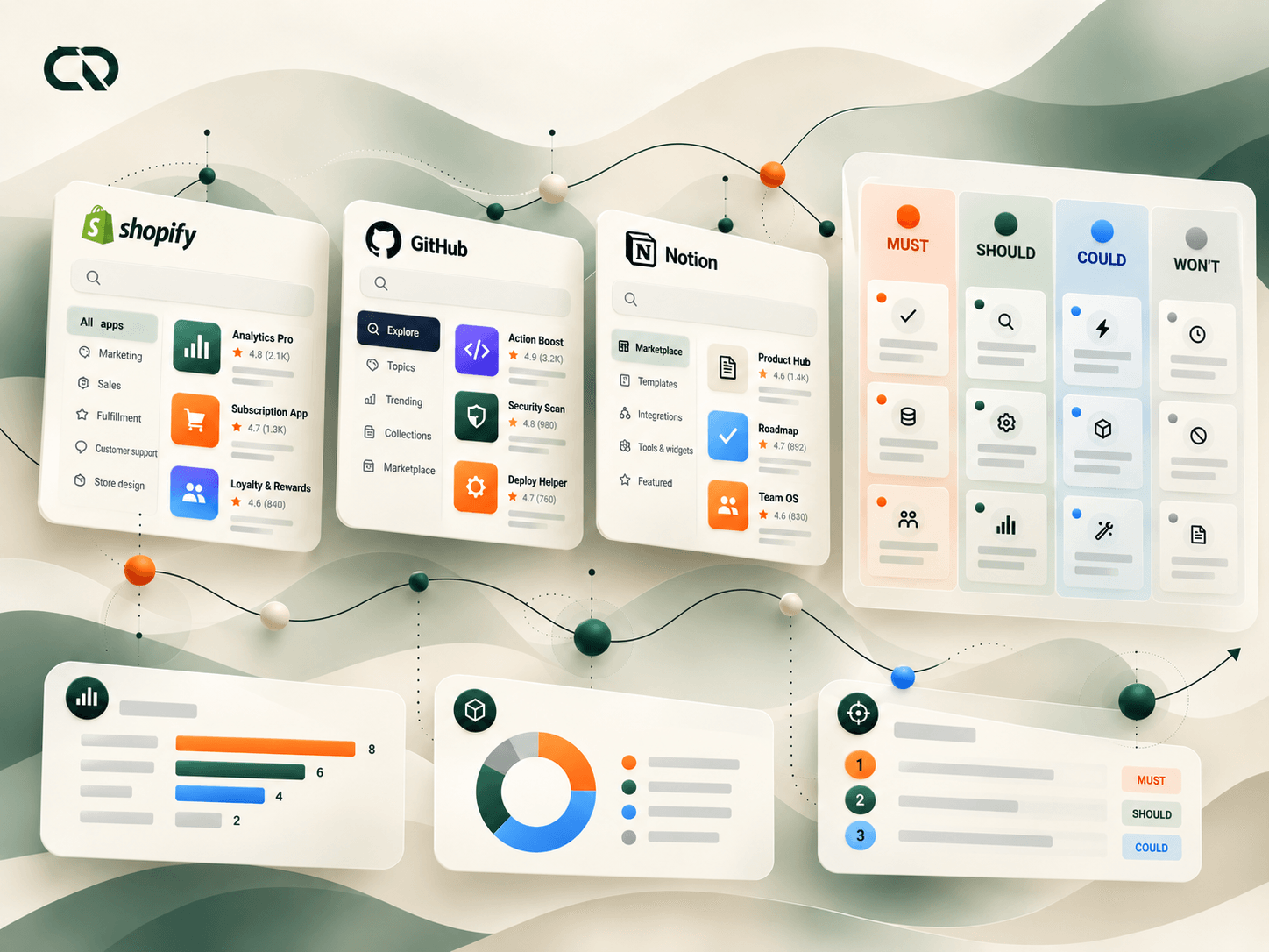
The benchmark documented in the case brought together references such as Shopify, GitHub and Notion to examine discovery, trust signals, detail and purchase completion. We focused on the purpose of each feature: helping people find a solution, feel confident evaluating it and understand how to continue.
Working with the Product Manager, I prioritized the essential flows. The documented MoSCoW organization placed publishing, search and checkout among the core needs, with improvements to administrative review and trust signals as complementary areas.
This definition helped distribute the effort. Before multiplying features, the experience needed to connect a published product with someone who could find, understand and purchase it. Documentation and review were also part of that relationship.
The priority was continuity: each stage needed to provide enough information for the next one to happen.
Separating discovery, evaluation and management gave each area a purpose.
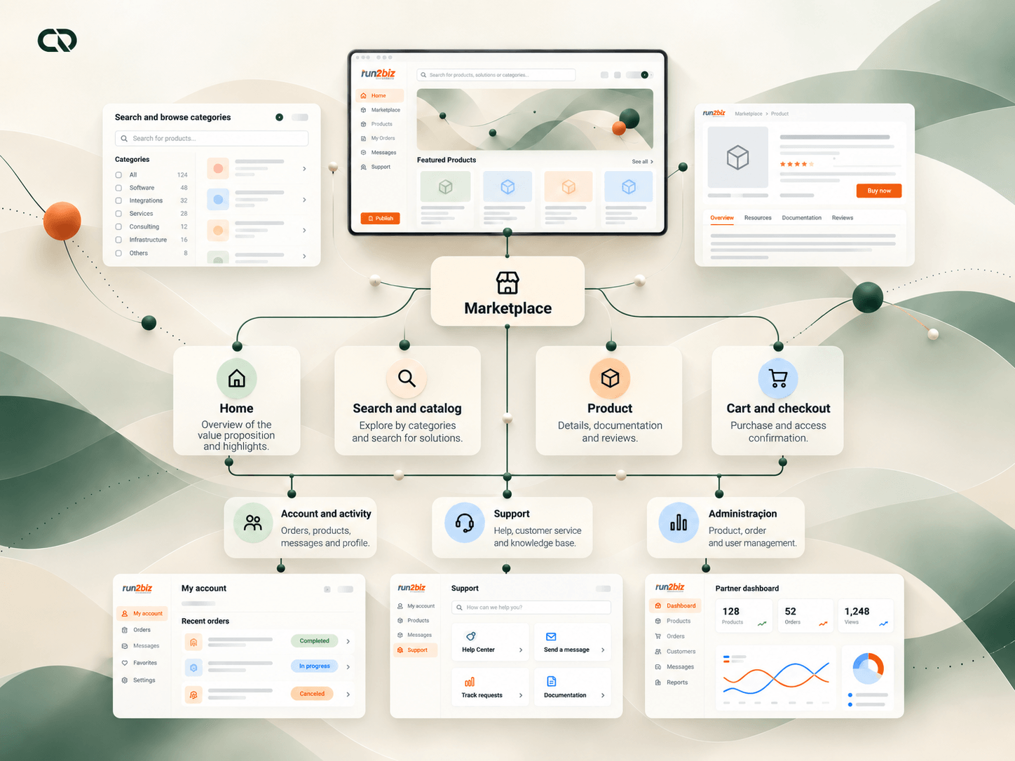
I structured the architecture to connect the Home page, marketplace, product detail, cart, checkout, dashboards and support. The Home page introduced the proposition; the catalog supported exploration and search; product detail enabled deeper evaluation; the purchase flow organized completion.
Account areas extended the experience. Buyers needed to check products and activity. Publishers needed to manage their solutions. Administrators needed to review submissions and monitor the catalog. This division guided navigation, content and permissions.
The architecture also established relationships between areas: publishing data fed the product presentation and supported review; purchasing led to a tracking environment; support and documentation remained accessible throughout use.
The structure connected what had previously been a business proposition: pages, information and tasks became paths that could be discussed and developed in detail.
Discussing the structure before refining the visual design.
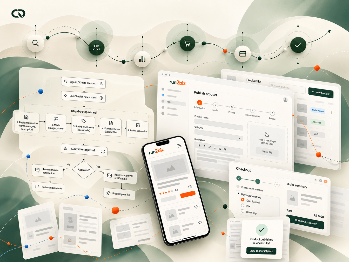
I developed wireframes to explore hierarchy, organization and navigation before the final UI. The Home page, catalog, product detail, cart, checkout and dashboards were treated as parts of connected paths, so we could assess how someone would move from one task to another.
Conversations with the Product Manager, stakeholders and the technology team helped adjust stages and consider feasibility. The designs included rules, permissions and interaction states, alongside the placement of elements on screen.
In the purchase flow, for example, the selection needed to connect with item review, data entry, payment and confirmation. In publishing, the sequence needed to organize submission and administrative review. Wireframes allowed us to discuss these differences before the final visual treatment.
This stage brought clarity to the team's work: we could evaluate paths and dependencies while looking at the whole experience.
Publishing a product also meant preparing it for evaluation.
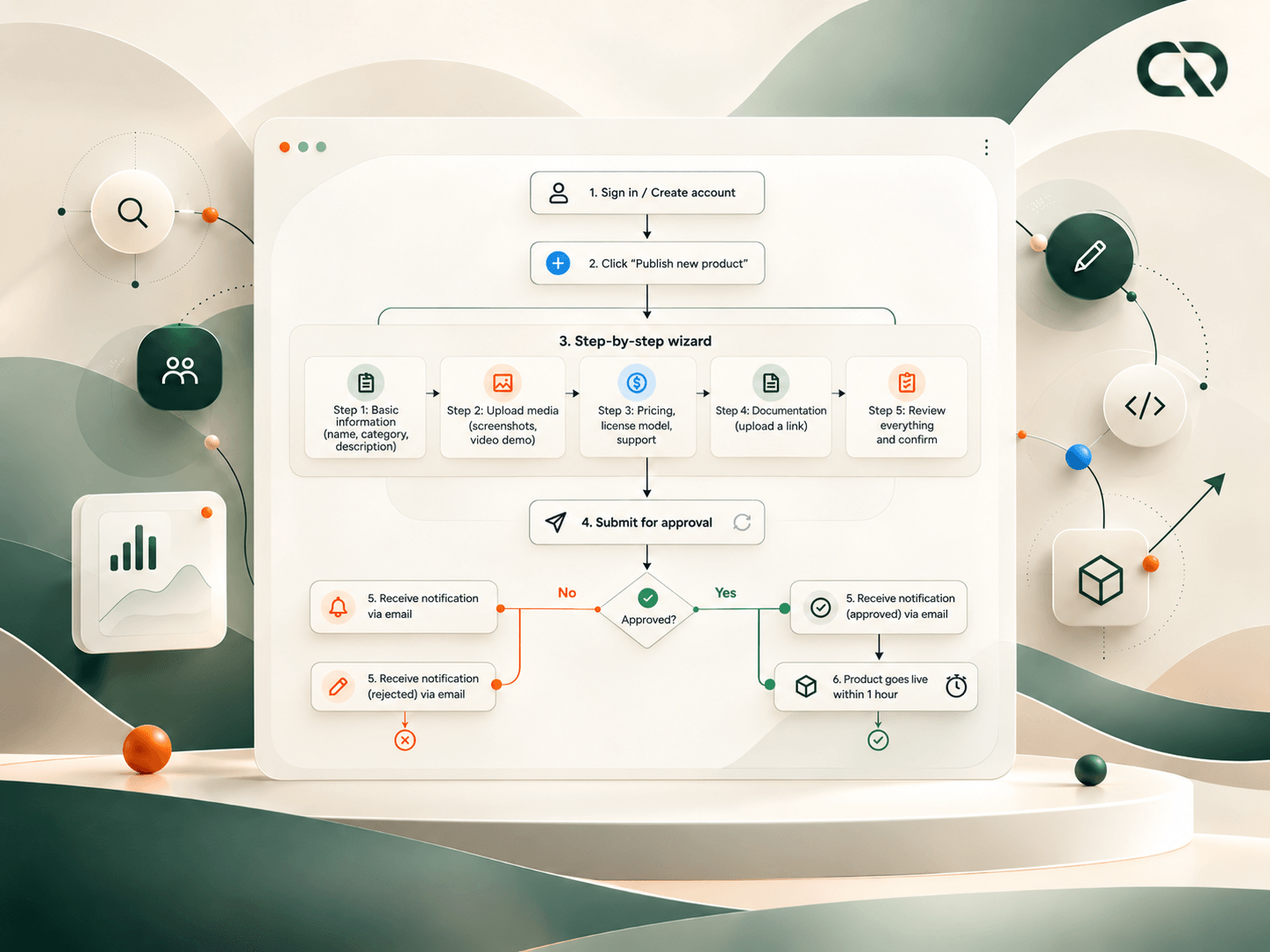
Ready for review
Publishing required content of different kinds. I organized the forms into a sequence covering identification and description, visual materials, commercial terms, documentation and a review before submission.
Guiding completion
This division had a purpose: making each request understandable and helping developers gather what they needed to present their solutions. Validation states and messages were part of the path, guiding completion and the next steps.
Connecting publishing and review
The flow extended to administration. After submission, the information needed to support the review and communication of the outcome. Review was therefore a responsibility connected to publishing: what the form requested should be useful to the people evaluating it later.
The focus was on the handoff between people: organizing the submission so the product could be understood, reviewed and presented in the marketplace.
Choosing a product needed to lead to a place to use it.
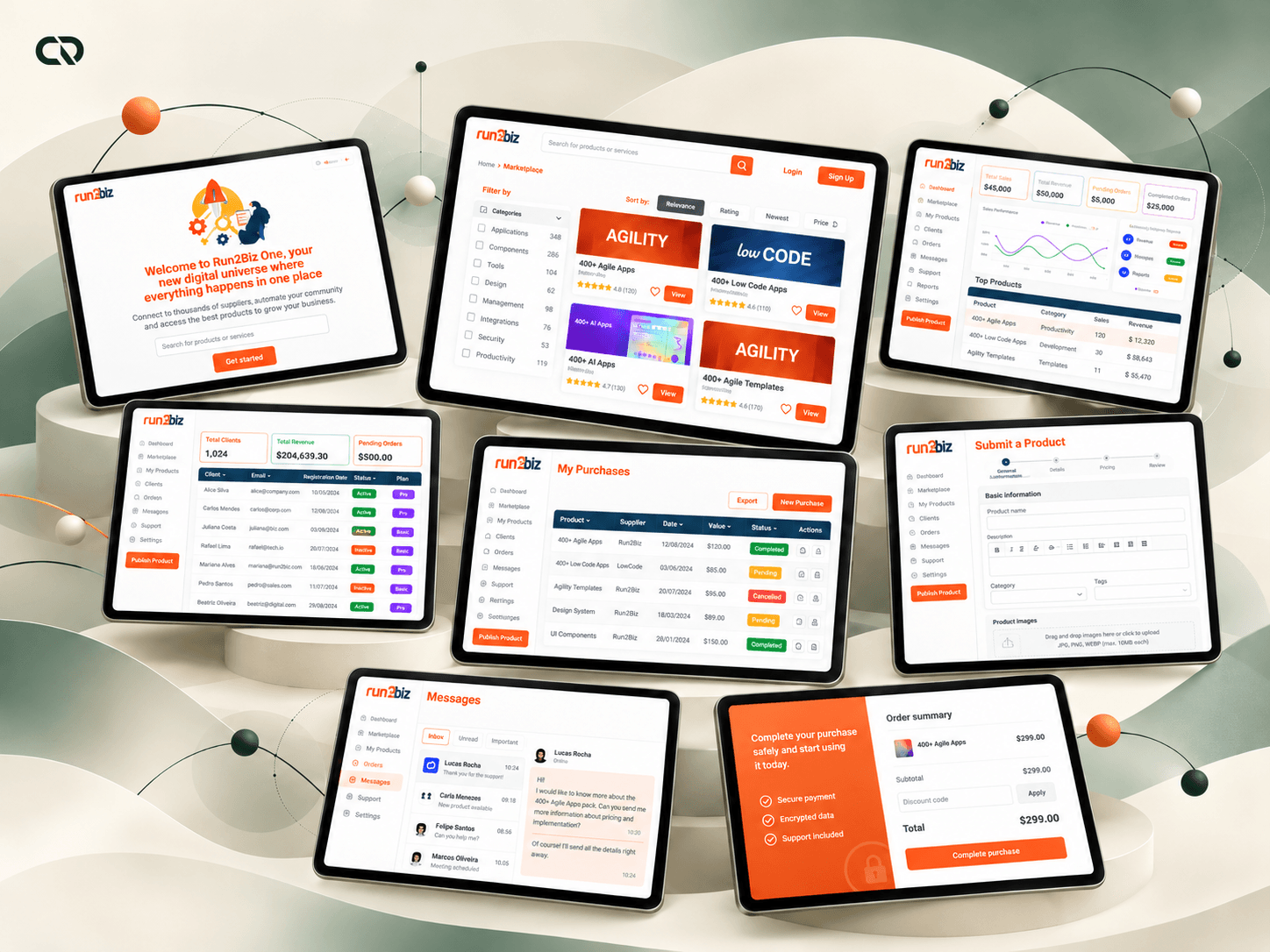
I organized purchasing as part of a journey that continued after the transaction. Evaluation on the detail page connected with the cart and checkout; account areas brought together what people would need to check and manage afterward.
The dashboard screens show this continuity through concrete tasks: tracking purchases and products, checking information, accessing messages and requesting support. Forms, states and copy needed to guide both purchase completion and the return to the account area.
The public My Desk documentation describes this connection between the marketplace, registration, email confirmation, payment and the applications dashboard. It also presents subscription, support and documentation areas. It is a public reference for the marketplace's role as an entry point to the ecosystem.
The purchase flow had a destination: helping people reach the product and giving them ways to continue their relationship with it.
A common foundation for different pages and tasks.
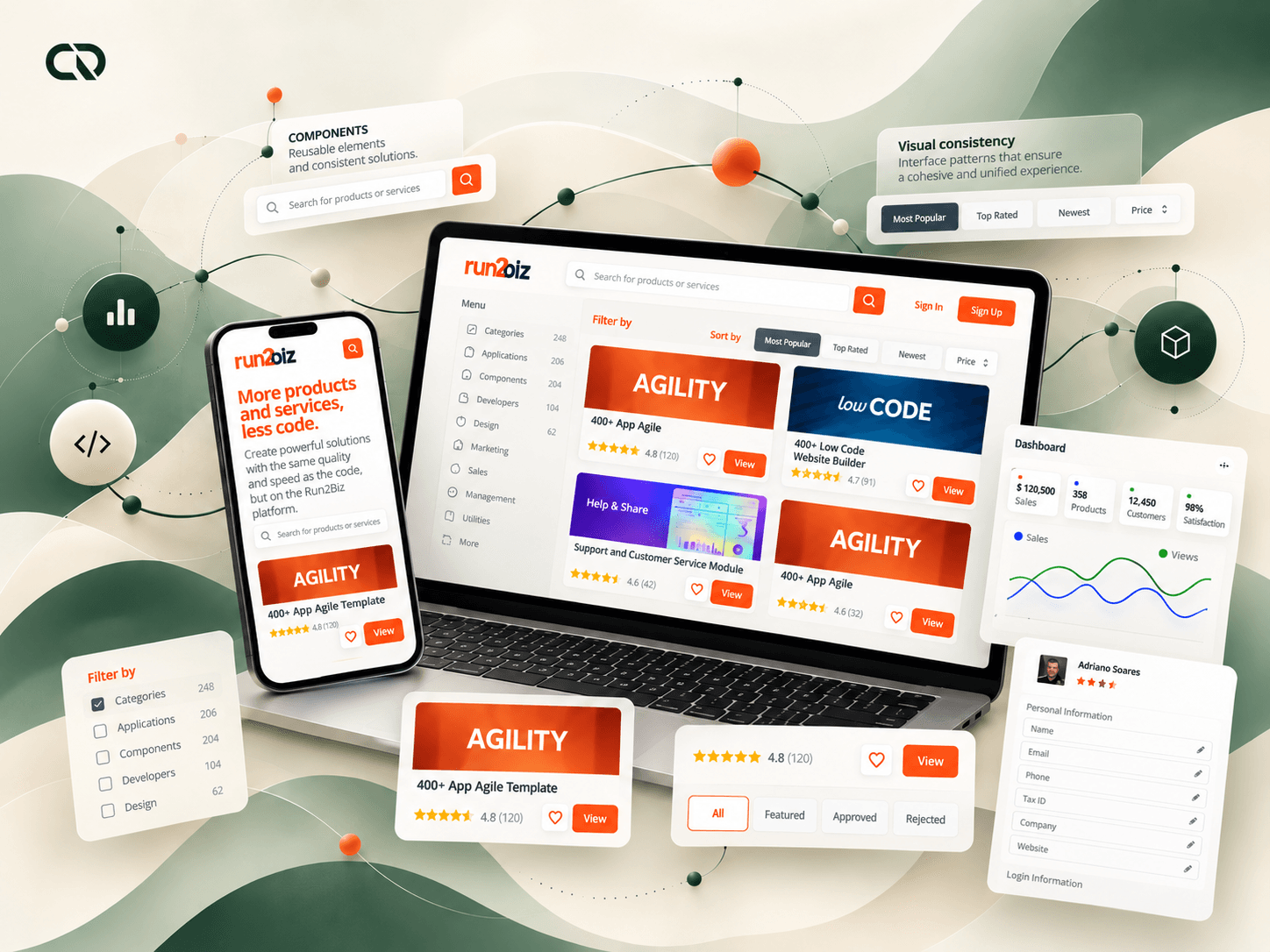
I created a foundation of components and patterns to make the experience consistent. The work covered typography, colors, spacing, iconography, illustrations and reusable elements, with Bootstrap Grid as a structural reference.
Fields, buttons, cards, tables and messages needed to follow a shared logic across the catalog, forms and dashboards. This allowed the existing identity to become a product system, with rules for composition and interaction.
I considered responsiveness, accessibility and documentation to support development. The detail included focus, error and loading states, as well as copy explaining how to complete fields and continue actions.
Consistency came from behavior as well as appearance: different tasks could share recognizable patterns while each area retained the information its audience needed.
The value of the delivery lies in connecting the paths.
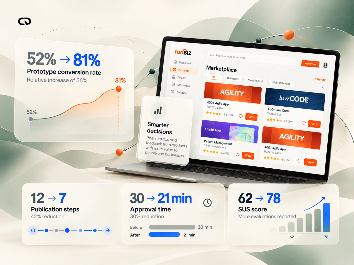
The project material reports a change from 12 to 7 publishing steps and from 52% to 81% conversion in the prototype. These figures belong to the evaluation described in the original case; prototype conversion does not represent marketplace sales in production.
The design contribution was to structure publishing, purchasing and approval flows, connecting public pages, dashboards and support. The component foundation and documentation provided a shared reference for discussing, implementing and evolving the experience.
The design outcome was to give the product form: the marketplace proposition gained connected journeys, interfaces and patterns that considered the responsibilities of publishers, buyers and administrators.
A structure for discovering, purchasing and continuing.
connected critical flows: publishing, purchasing and approval
The deliverables connected four reference profiles and three critical flows, publishing, purchasing and approval, within a shared experience foundation. My work spanned architecture, forms, interfaces, messages and components, in collaboration with product and technology.
an experience with different responsibilities
Developers, technical buyers, end users and administrators guided the depth of information, language and tasks.
a connected working structure
Publishing, purchasing and approving required distinct paths and information that complemented one another across the stages.
The product's public continuity
In October 2026, the Run2Biz website presents the 4biz One marketplace as an entry point to the ecosystem's solutions. Public documentation connects purchasing, access to applications and subscription management. These records provide context for the product's continuity as it has evolved.
The project deepened my practice at the intersection of architecture, interface and business rules. Simplifying a platform for different audiences requires deciding what each person needs to understand at each moment. Through that work, I turned a broad proposition into flows and components that could guide the product's construction.