

Uber: the weight of your car
Supporting UI design for an interactive Uber Brazil campaign created by Moringa, making the costs and everyday frustrations of owning a car tangible.
How much does owning a car cost? The answer usually starts with the purchase price, but continues with fuel, maintenance expenses and everyday strain. The Weight of Your Car campaign turned that question into an interactive experience: a test that connected the numbers to each person's life.
This was my first project as a UI Designer. I supported UI design as part of the Moringa Digital team. It introduced me to a concrete design challenge: presenting a sequence of information while keeping the experience light and engaging enough for a campaign.
Moringa Digital was the link between the team and Uber, in a collective effort that connected the interface to the campaign concept.
A calculator also needed to speak to life beyond the numbers.
Uber wanted to encourage reflection on private car ownership and present mobility alternatives. The experience considered both expenses and emotional factors: finding parking and getting stuck in traffic were part of the assessment, alongside vehicle costs.
Beyond expenses
The design challenge was to turn that combination into questions people could answer. A financial form could collect the figures, but the campaign also needed to represent familiar situations and sustain interest throughout the test.
The metaphor of weight
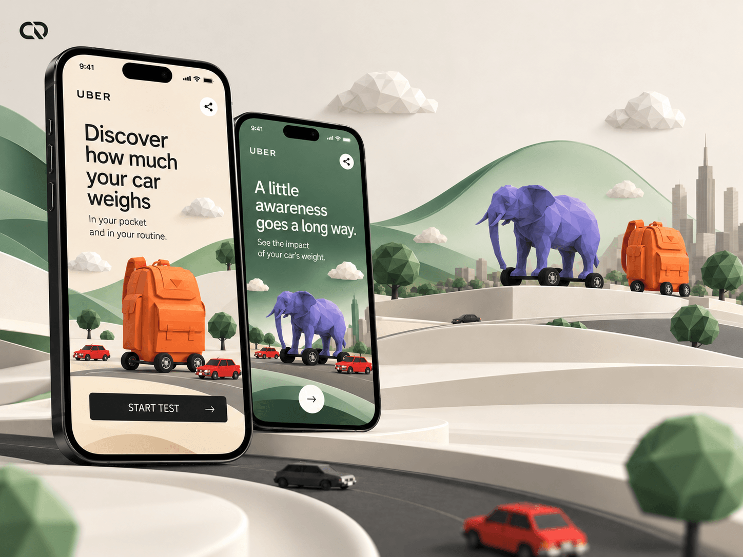
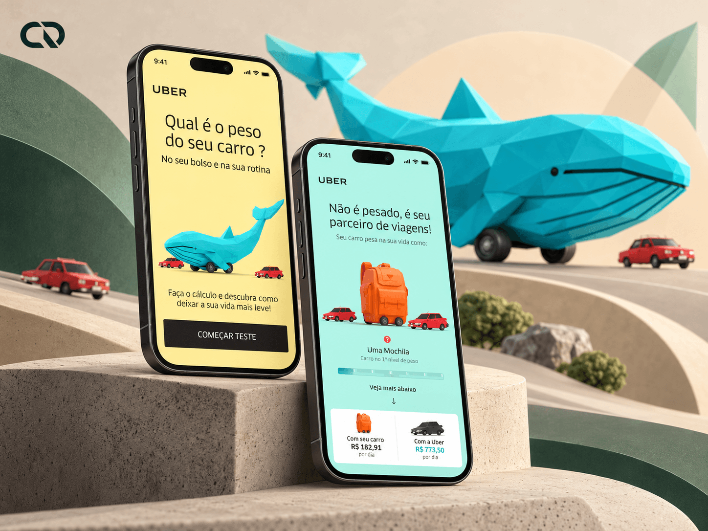
The chosen direction gave shape to the idea of weight. The opening question connects the car to everyday life, while the illustrations introduce the playful tone of the experience. From the start, people are prepared for a result that communicates through both calculation and imagery.
The problem guided the solution: making expenses and everyday frustrations tangible within a single experience.
Organizing the conversation before detailing each screen.
One question at a time
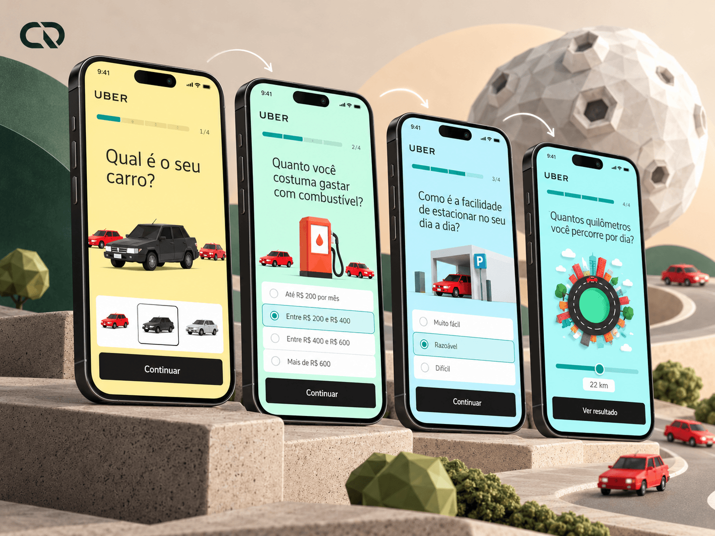
The team gathered the questions and explored ways to present them. One option was a natural-language form. The adopted solution used a step-by-step sequence, separating information requests to build the test progressively.
Focus on the current step
That choice appears in the final screens: one main question, an interaction for answering it and a progress indicator. Rather than showing every field at once, the interface focuses attention on the current topic. The counter helps people understand where they are in the journey.
Prototype before refinement
The structure went through low-fidelity prototypes and feedback from the Uber team before visual refinement. This stage made it possible to discuss the path and the information requests; the final screens give that structure a visible form.
A shared foundation, different answers: navigation provides continuity while each step uses its own way of representing the question.
Answering was part of the campaign experience, too.
For the car purchase question, cash and instalment options are accompanied by whole and divided versions of the vehicle. For consumption, a numerical control sits alongside an image of a pedal. The illustration follows the topic and makes answering part of the composition.
Everyday perceptions
The parking question asks people to drag the car to a position between two extremes. Here, the answer describes a perception of everyday life. The same sequence accommodates choices, amounts and subjective assessments without presenting every question as an identical field.
A shared visual language
The team used low-poly 3D illustrations to support this language. The project credits attribute their creation to Walison Borges. The interface brings that identity into the questions, controls and navigation.
It was within this collective effort that I supported UI design. The screens show the relationship the project needed to build between imagery, information and action: visual elements take part in the question and help unify the journey.
The calculation ended with an image that gave the journey meaning.
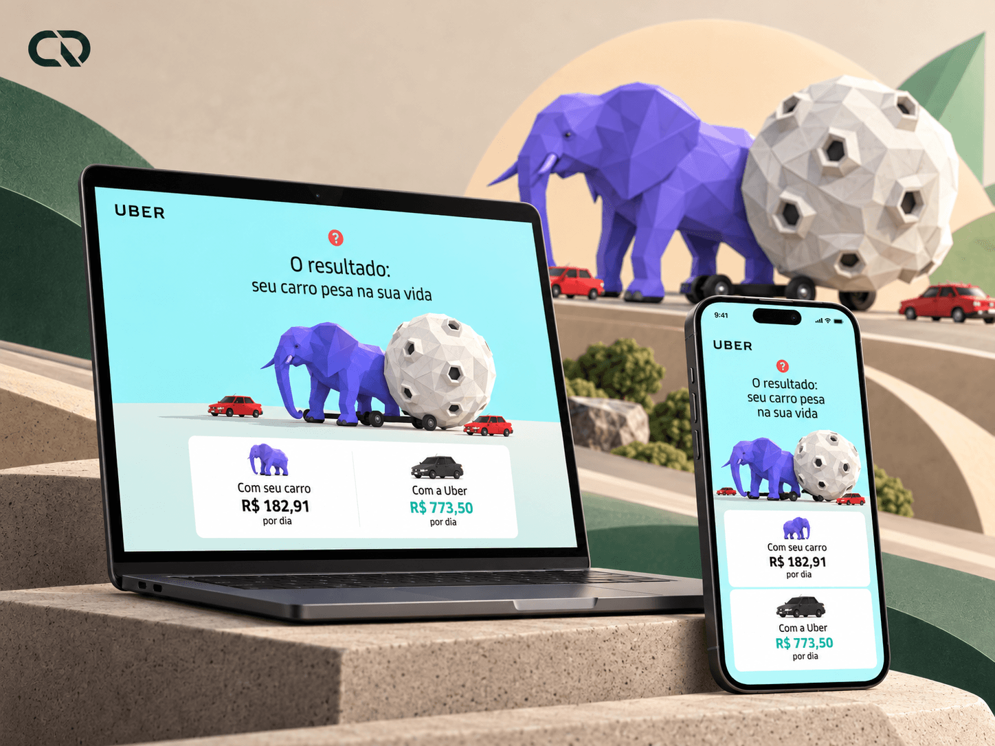
After answering questions about their car and everyday life, people encountered a representation of its weight. The team used heavy figures and objects to turn an abstract assessment into an understandable image connected to the campaign concept.
In the preserved screen, an elephant accompanies the message “A burden you don't forget”. The composition brings the emotional result together with a cost comparison between owning a car and using Uber. The calculation supplies the financial reference; the metaphor conveys what it feels like to carry that cost every day.
The result completes the path opened by the first question. Purchase, fuel and parking are no longer separate answers; together, they provide a picture of car use. The experience creates a basis for reflecting on mobility, in line with the campaign's intention.
The delivery brought structure and expression together: a step-by-step test, tailored interactions and a result connecting financial information to the visual narrative.
The reflection continued beyond the first image.
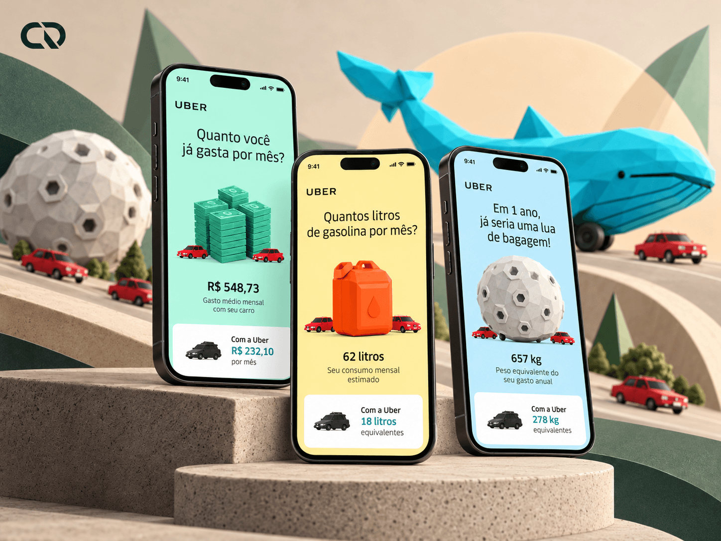
The project video preserves further details of the final experience. After a representation using a whale, the result compares owning a car with using Uber. The sequence also presents accumulated expenses and a visual equivalent for fuel consumption.
These extensions carry the campaign idea forward: monetary amounts appear alongside a representation of scale. The result goes beyond an isolated number, presenting the answers from different perspectives to support reflection on everyday life.
The records show journeys with 13 and 14 steps. In both, progression organizes the questions and leads to a comparison accompanied by visual metaphors.
From the question to its implications, the interface connects participation, comparison and visual metaphor to make the campaign message tangible.
A first contribution to UI design, within a recognized campaign.
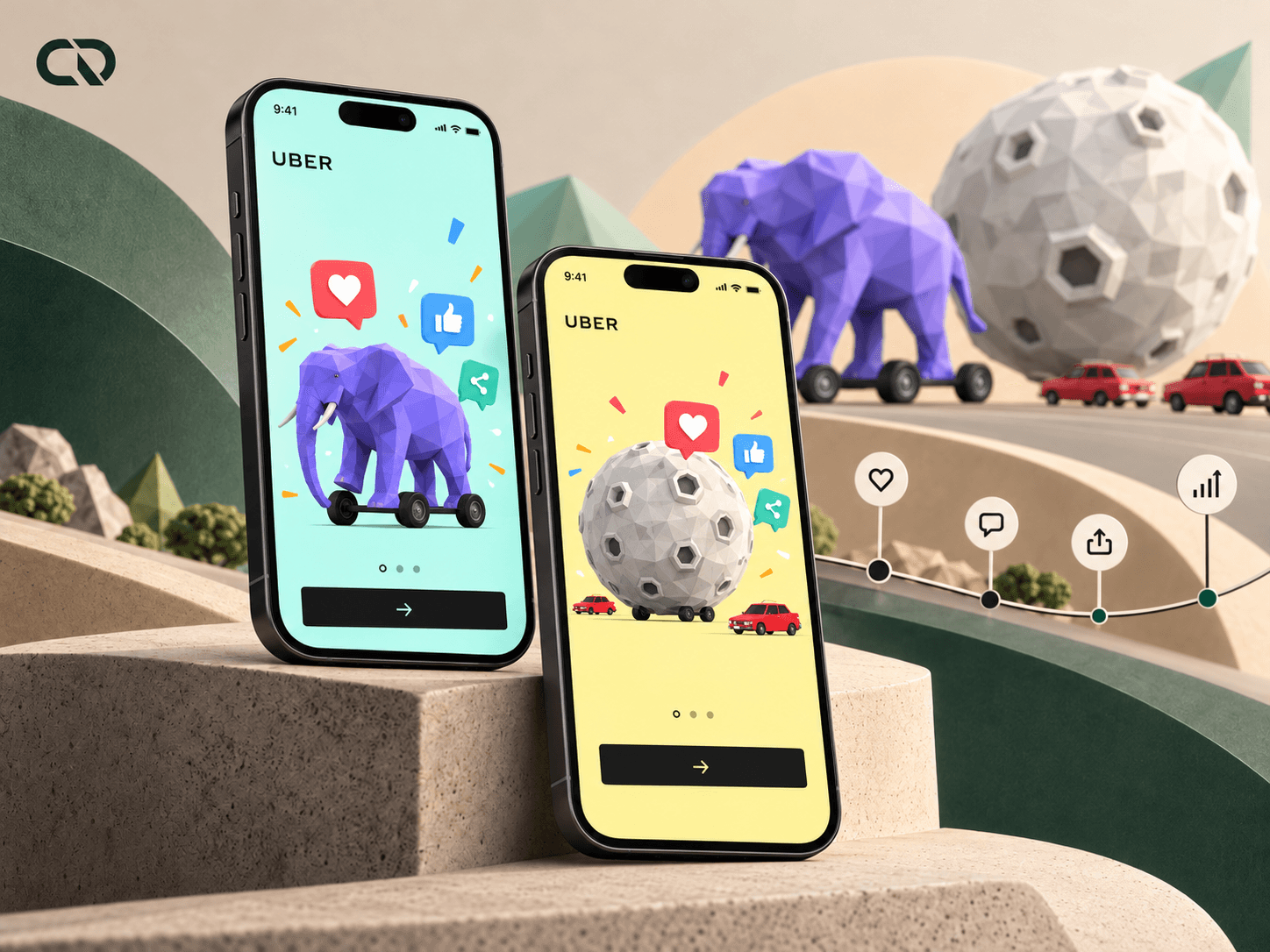
The campaign brought the public an experience that turned habits and expenses into a visual reflection on mobility. Uber launched the test in 2018, and the work received recognition the following year.
Although I was credited as Art Director, my contribution was to support UI design. Isabella Barbosa led the UX work and was credited with UX/UI. Moringa Digital was the link between the team and Uber. The campaign recognition reflects that collective effort.
From launch to campaign recognition.
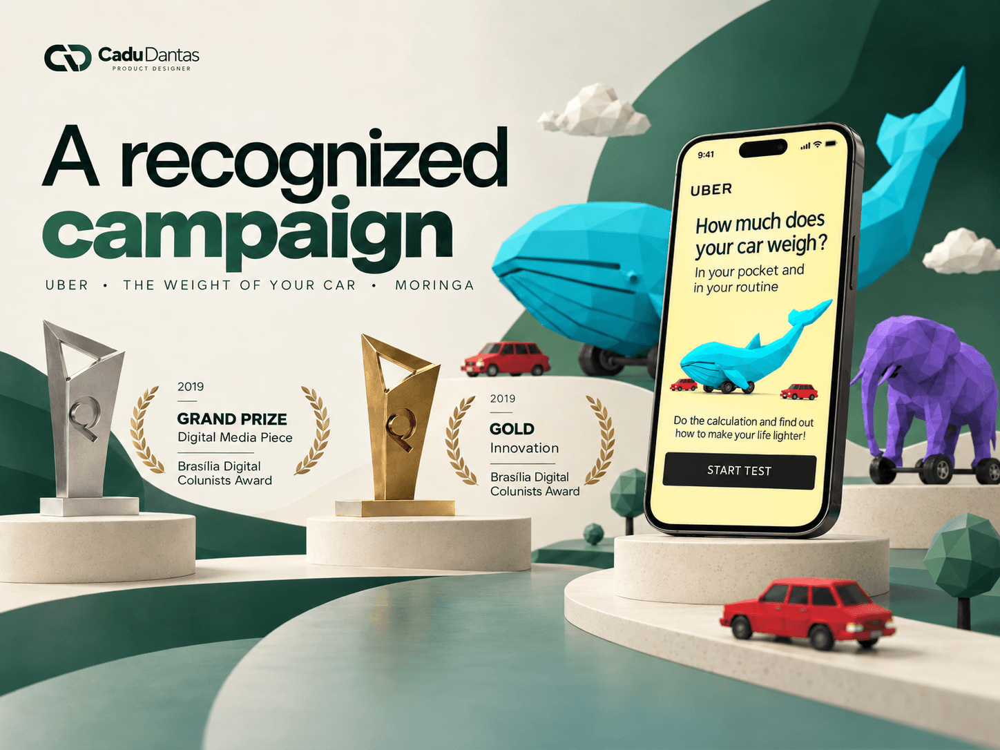
Recognition at Prêmio Colunistas Brasília
Publicly launched by Uber on August 17, 2018, the campaign received the Grand Prix for Digital Media Piece and Gold for Innovation at the 2019 Prêmio Colunistas Brasília, as documented by the team. These recognitions celebrate a collective effort.
Digital Media Piece
Prêmio Colunistas Brasília, 2019. Recognition of the campaign as a collective effort.
Innovation
Prêmio Colunistas Brasília, 2019. An award documented by the project team.
What stayed with me from this first experience
As my first project in the field, this work marks my entry into interface design. Its value lies in contributing to a solution where screen design needed to support a campaign idea, a sequence of answers and an understandable result.
Confidentiality note: This case study presents a selection of the work while respecting the confidentiality of client and team information. Research records, wireframes, exploratory prototypes and other internal materials are therefore not shown. The process is described through the challenges, decisions and screens from the publicly launched campaign and web app.