

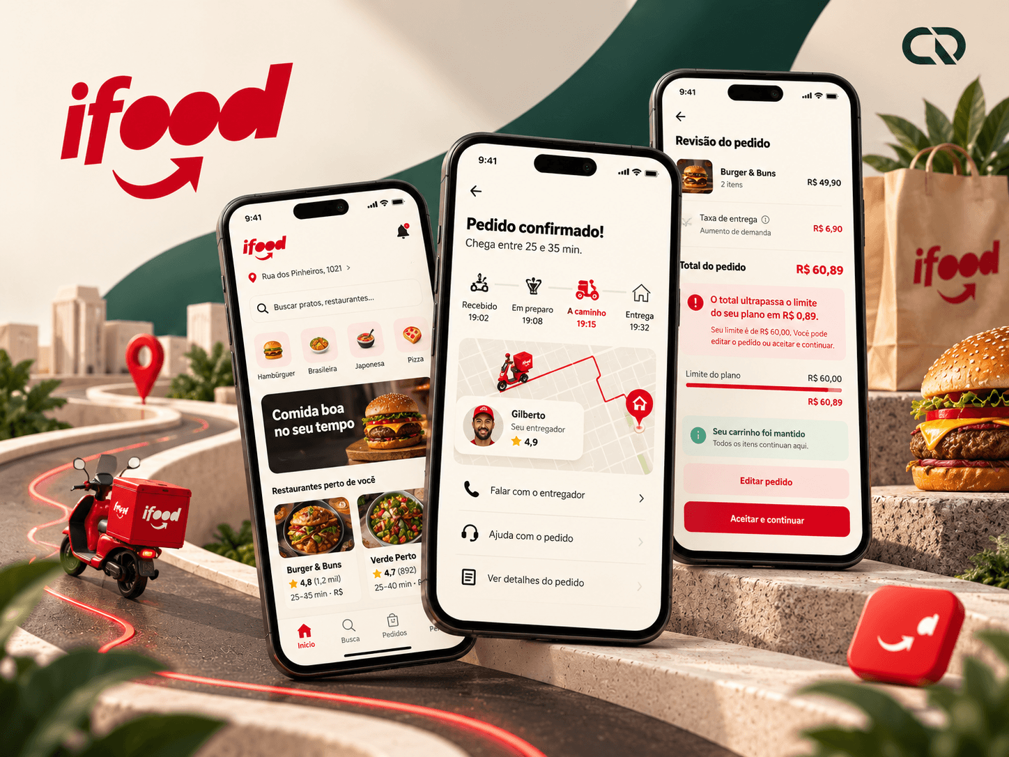
iFood à Mesa
Ordering food is simple. Deciding together can be better.
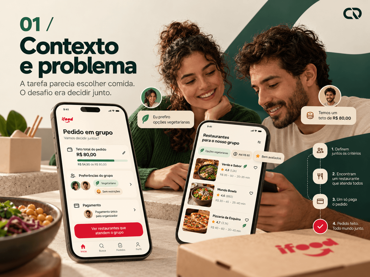
Two people want to order food. One prefers a vegetarian option; both need to stay within a budget. Before choosing a dish, they share a decision: where to order, what fits the budget and who will organize everything.
iFood à Mesa proposes bringing these conditions together in a plan that follows the choice through to confirmation.
This independent project was developed with AI assistance, with no affiliation with the brands. Primary research and business impact remain to be validated.
The task seemed to be choosing food. The challenge was deciding together.
Framing the experience before designing it
Looking at what happens between screens
The starting point was an order for two people. The organizer needs to reconcile preferences, gather choices, check fees and take responsibility for payment. A product can offer plenty of restaurants and still leave some of that coordination to conversations and calculations outside the flow.
Turning the scenario into a question
How can two people choose from the same restaurant, with different preferences and an explicit overall budget? This framing shifted attention from the number of options to the quality of the decision. The question then guided what needed to be shown and when.
Defining the value the proposal should deliver
For the organizer, the intention is to make choices and the full cost understandable. For the participant, it is to offer autonomy with context. The product hypothesis is that a shared plan could reduce revisions at checkout. This friction still needs to be investigated with users; here, it guides a design exercise rather than a measured diagnosis of the current app.
The references helped shape a direction.
Interpreting principles rather than adding features
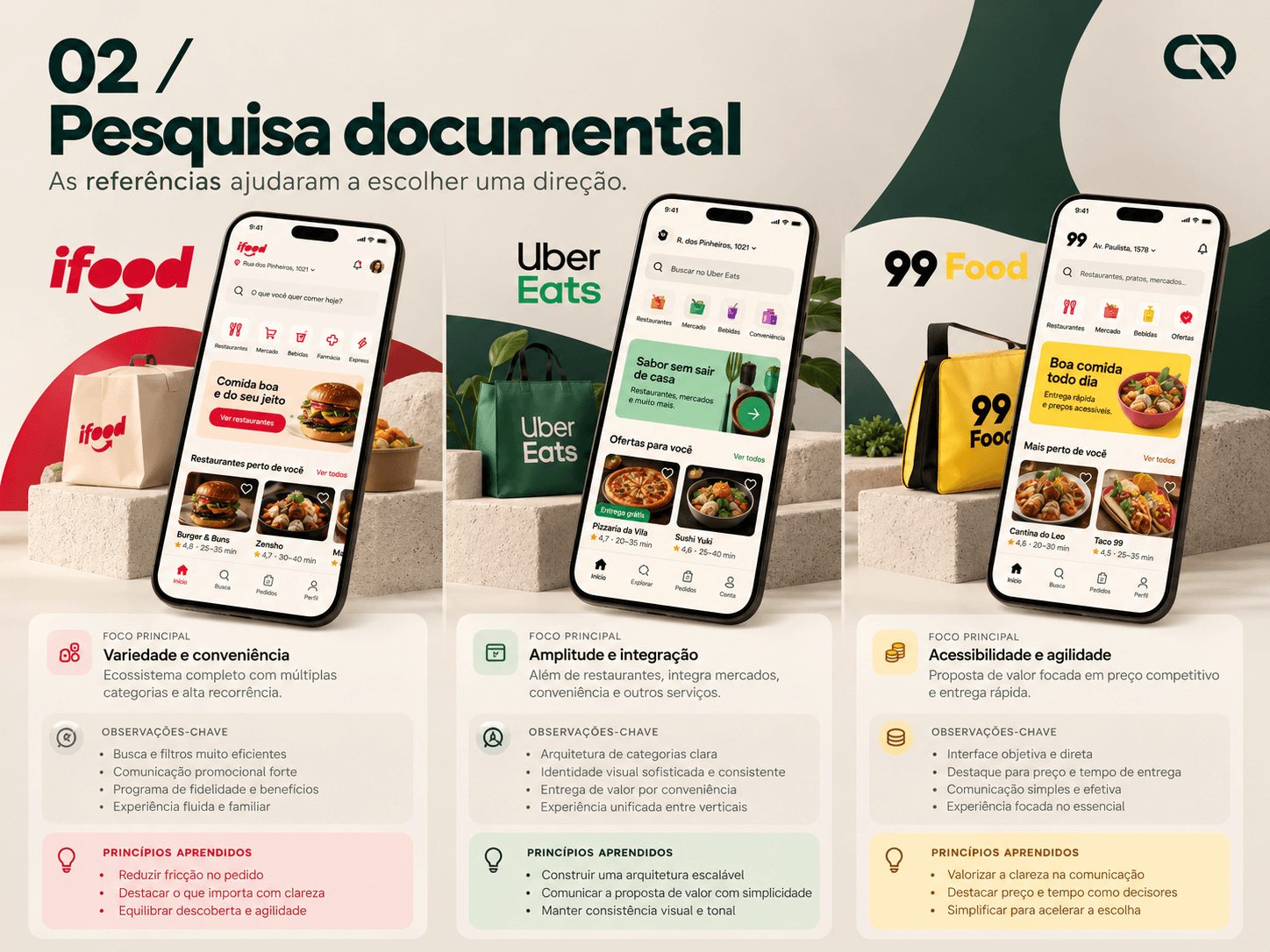
Preserving what is already familiar
iFood provided the context: search, restaurant, basket and tracking form a familiar food-delivery language. Public sources also describe AI initiatives such as Ailo. This led to a decision: the project would not need to justify its relevance by introducing another assistant.
Learning from coordination and perceived value
An Uber Eats publication describes group orders, split payments, deadlines and reminders. The principle adopted was to let each person choose their own dish. Meanwhile, 99Food's messaging about price and access reinforced the importance of explaining what the experience costs, without importing historical promotions into the concept.
Giving the references a role in the project
The synthesis was to connect criteria before exploration: the table's budget, preferences and timing. This led to the proposal of comparing equivalent combinations while keeping the context through to review. The benchmark is based on documents covering specific periods and markets; it is not an audit of every version of these apps.
Before defending the solution, understand the habit.
What to investigate and whom to learn from

Separating observation from hypothesis
Public references support the existence of AI initiatives and group ordering. On their own, they do not explain how people negotiate lunch, when they discover the total or why they abandon a choice. That gap defined the research plan.
Investigating real episodes
The proposal is to interview 6 to 8 people who have recently organized or joined group orders. The guide starts with their most recent episode: how they chose the restaurant, when they learned the cost, what changed along the way and how they resolved disagreements. The aim is to understand behavior before asking for opinions about the feature.
Designing for two perspectives
Two provisional profiles were defined to develop the scenario. The organizer needs to gather choices and confirm the bill; the participant needs to understand the restaurant, budget and payment arrangements before choosing. These profiles guide the interface but are not validated personas. In the research, consent, anonymization and traceable evidence should support a responsible synthesis, including when AI is used.
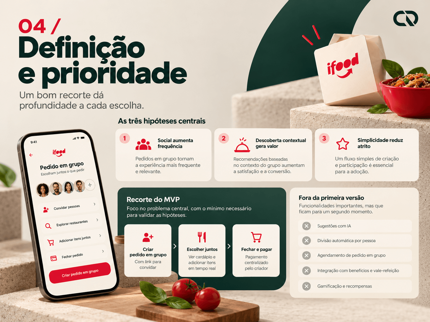
A focused scope gives each choice more depth.
Hypotheses, scope and trade-offs
Focusing the problem on three hypotheses
The first hypothesis is that showing the total including fees improves understanding of the comparison. The second is that agreeing on criteria before the list avoids redoing choices. The third is that separating individual selection from collective review makes responsibility for the order clearer. Together, these provided criteria for assessing the screens beyond their appearance.
Choosing what belongs in the first version
The scope includes two people, one restaurant, one address, a vegetarian preference, a total budget, comparison and an invitation. The organizer pays. This decision keeps the flow verifiable and allows a deeper exploration of the relationship between selection, price composition and confirmation.
Recognizing the cost of alternatives
Splitting payment seems like a natural next step, but it requires handling authorization, expiry, withdrawal and refunds for each participant. It was therefore left out of the MVP, along with additional participants and scheduling. The first goal is to discover whether the shared plan makes sense, then assess which additional layers deserve investment.
The plan needs to stay with people to the end.
Connecting stages, roles and information
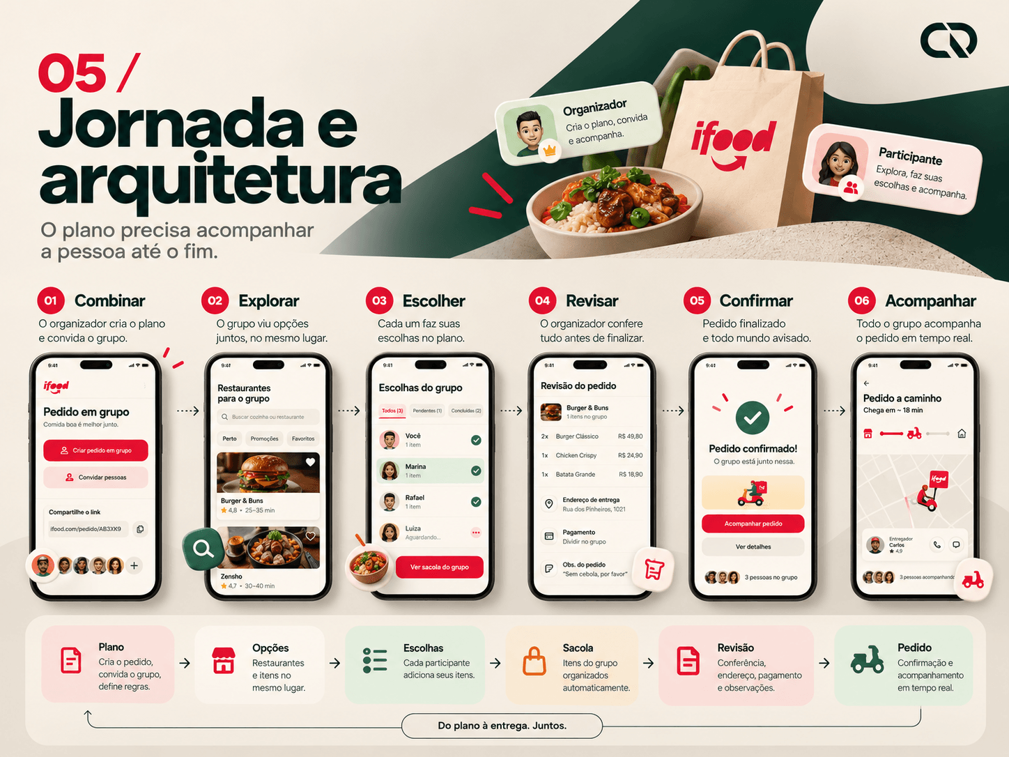
Organizing the journey
The journey was structured around six moments: agree, explore, choose, review, confirm and track. The organizer defines the plan; the invitation brings that context to the participant; choices meet in the basket before payment. The experience therefore does not depend on everyone starting from the same screen.
Giving collaboration a structure
The table brings together criteria, participants, the restaurant and the basket. Each item belongs to a person. The order is created only after review and confirmation. This separation helps distinguish a selection still being assembled from a purchase that has actually been confirmed.
Maintaining continuity when things change
Returning from a dish should preserve the plan. Changing restaurants requires explaining the effect on the basket. A price change needs to appear before the charge.
These rules emerge from the architecture and guide interface states rather than becoming fixes added later.
First, decide what appears. Then, how it will be read.
Structure, hierarchy and content
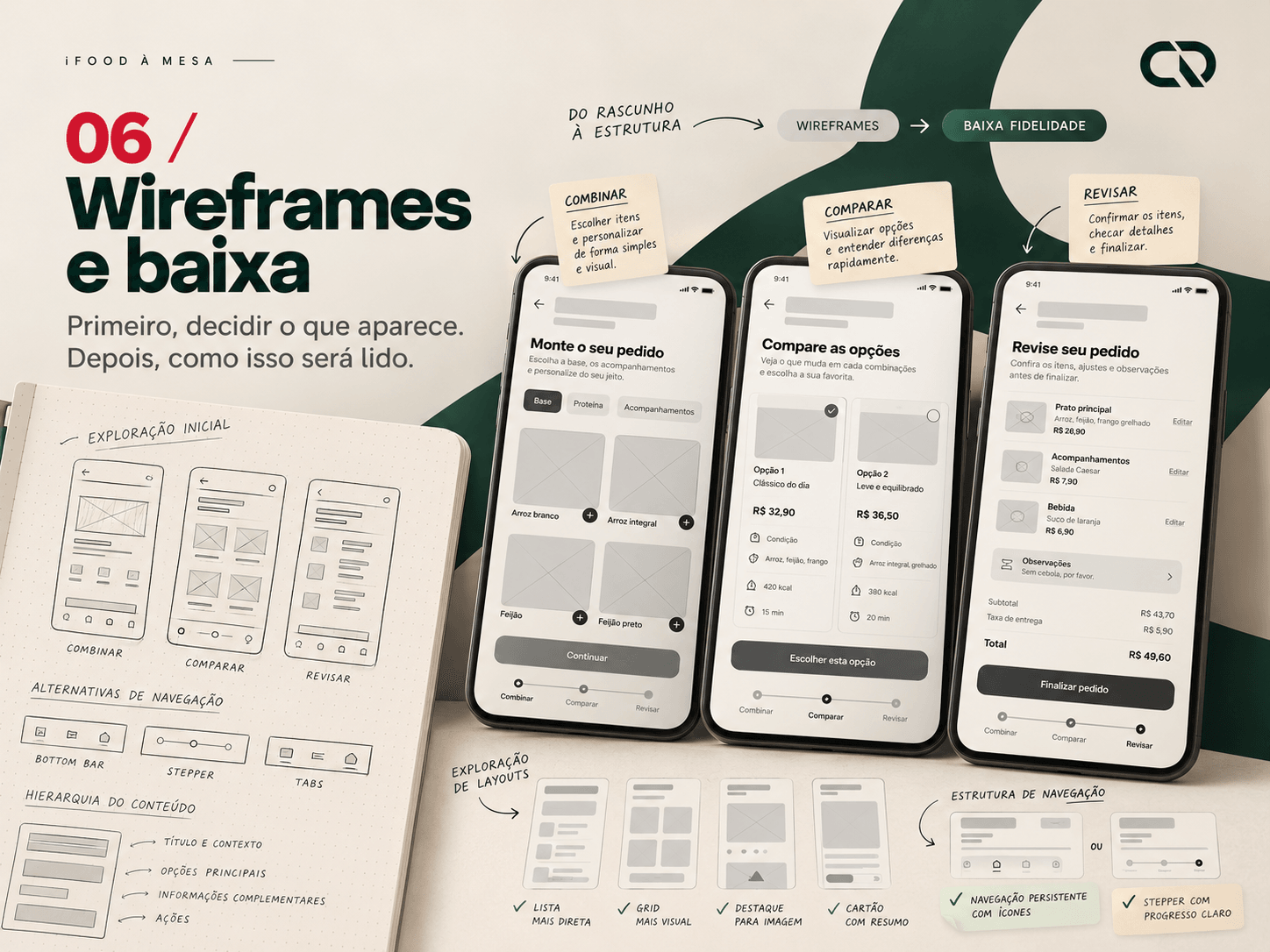
Making the reasoning visible
The wireframes placed the plan before the list and used the same criteria in the comparison. At low fidelity, labels and amounts made the budget including fees and the single payment explicit. This transition allows hierarchy and understanding to be reviewed before investing in visual polish.
A decision carried across versions
The total was prioritized without hiding its composition.
The intention is for people to compare a meal for the table, rather than comparing the price of one dish with the complete cost of another option.
Product rules need visual consistency too.
Foundations, components and accessibility
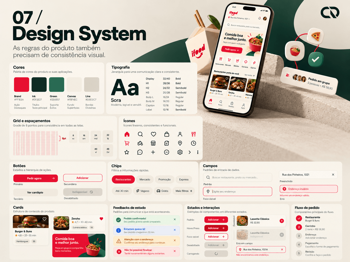
Building a reusable foundation
With the flow defined, the interface was organized into its own conceptual system: an 8-point grid, 24px mobile margins, sans-serif typography and neutral surfaces. Deep red guides actions; green supports confirmations and fulfilled conditions. This is not iFood's official component library.
Turning patterns into contracts
Buttons, filters, monetary fields, cards, participant rows, price breakdowns and alerts share tokens and content rules. Their contracts define what changes during focus, selection, loading, unavailability and error. The aim is to prevent the same rule from being interpreted differently across screens.
Designing beyond the ideal state
Text, status indicators and messages complement color. The main color pairs passed a scripted contrast check. Reflow, zoom, keyboard interaction and screen-reader use still require implementation and their own assessment. The technical package brings together tokens, a catalog and specifications to support that next step.
Choosing starts with shared conditions.
How the direction becomes an interface
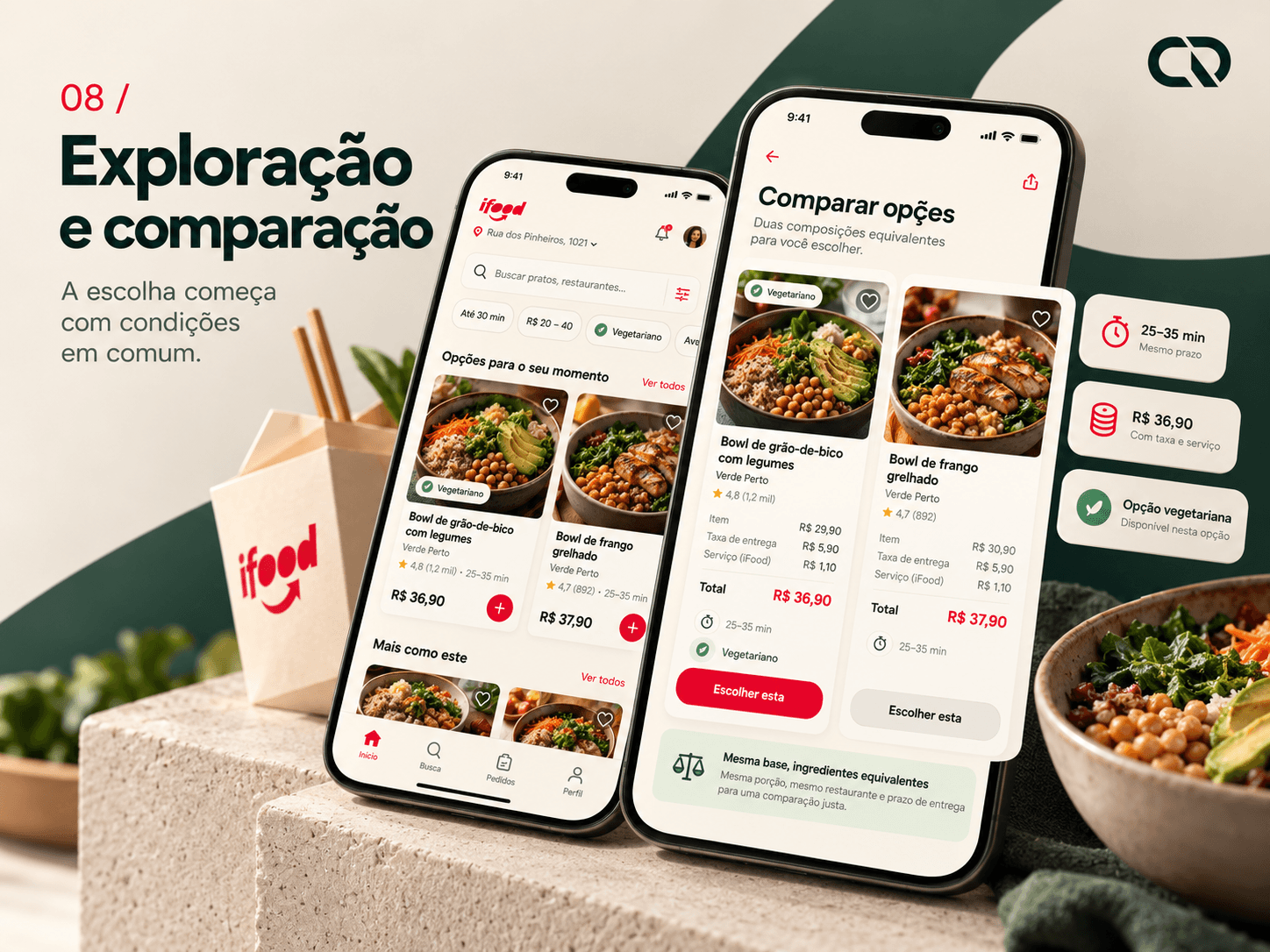
Defining the plan without interrupting other uses
The home screen offers an optional entry point for ordering together. The organizer enters participants, total budget, preferences and timing. The plan does not raise the budget or silently remove a criterion to produce more results.
Comparing the same kind of information
The list suggests combinations of two dishes including delivery and service. In the comparison, total cost, timing, vegetarian options and ratings occupy equivalent positions. The context remains visible on entering a restaurant. This sequence aims to reduce the need to remember amounts between steps.
Explaining the limits of an estimate
The upfront total applies to a defined combination. Extras or changes require recalculation. If catalog information and fees are unavailable, the product should explain that limitation rather than present an illusion of precision.
Autonomy to choose. Context to participate.
From an individual dish to a shared table
Detailing what supports a choice
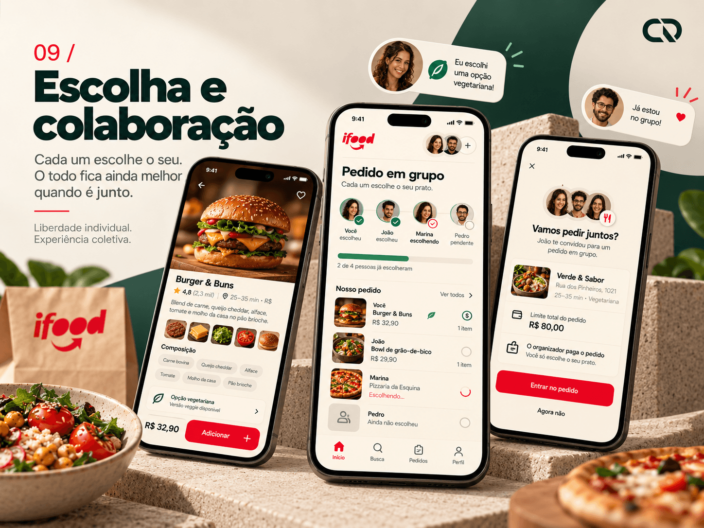
The dish screen brings together ingredients, price and the cutlery option. The vegetarian preference guides the menu; it is not a guarantee about allergens or preparation. This distinction prevents an interface simplification from communicating a level of safety it cannot ensure.
Bringing the plan to the invitee
After adding their dish, the organizer can invite the other person. The invitation explains the restaurant, budget and responsibility for payment. The participant chooses within that context without needing to reconstruct the whole conversation that preceded the order.
Making coordination visible
The table shows who has chosen and who is still waiting. Each item is associated with a participant, while review remains with the person paying. The displayed split is a reference for the group; it does not initiate individual charges or transfers.
The total becomes more than an isolated number.
Connecting choices, fees and commitment
A bill that can be checked
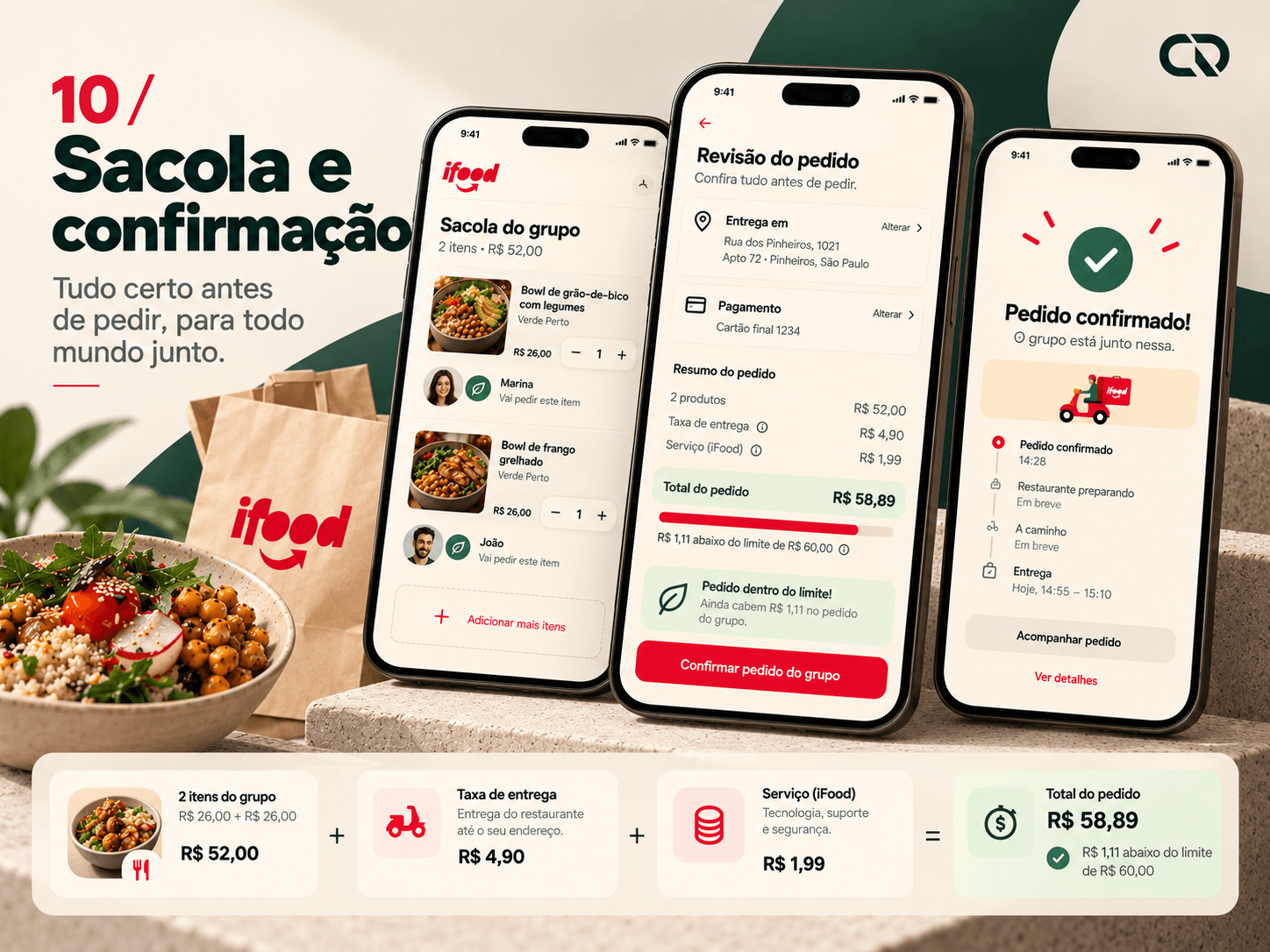
Two dishes at R$26.00 add up to R$52.00. With R$4.90 delivery and a R$1.99 service fee, the total reaches R$58.89, R$1.11 below the budget. The per-person reference is R$29.45 plus R$29.44; the remaining cent stays explicit.
Giving review a real purpose
Before confirmation, the address, payment method and delivery estimate appear alongside the full amount. The CTA states the commitment being made. Restaurants, dishes and prices are fictional examples used to keep the project's logic consistent across screens.
Connecting interface and business rules
In production, amounts would be stored in cents and revalidated on the server. Confirmation would need protection against duplicate submissions. These contracts support the trust the design seeks to communicate; a screen alone cannot resolve an inconsistent charge.
When the plan changes, the decision returns to the person.
Empty states, price changes and order status
Preserving what was agreed
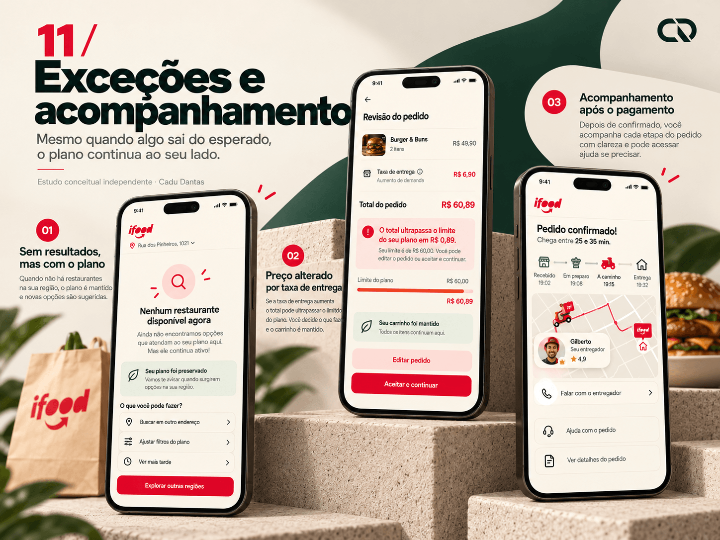
If there are no options, the interface suggests allowing more time while keeping the budget and preference. Editing criteria remains available. The recommendation offers a way forward without reconfiguring the plan on the person's behalf.
Making a change impossible to miss
If delivery rises to R$6.90, the total reaches R$60.89. The difference and exceeded budget appear before the charge, with an option to edit or accept. The basket remains available, avoiding the loss of work when conditions change.
Continuing after payment
Tracking presents understandable states, updated estimates and access to help. At handoff, this calls for contracts covering payment failure, unavailability and server confirmation. The aim is to maintain clarity even when the journey no longer follows the ideal path.
AI helped accelerate repetitive work.
Assisted production, automation and review
Using the tool for concrete activities
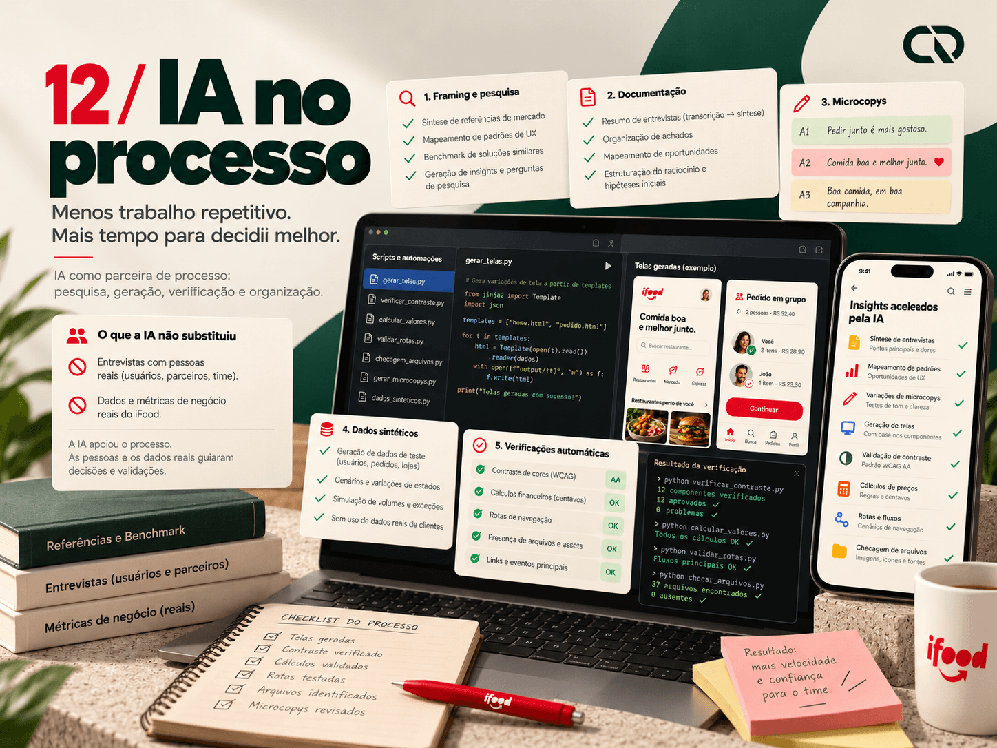
AI supported framing, desk research, microcopy alternatives, synthetic data and the code used to generate screens and documents. The intended benefit was to move faster between rules, content and visual representation while keeping the review of decisions part of the work.
Turning consistency into verification
Scripts generated CSS from tokens and checked contrast, calculations in cents, file presence and navigation routes. These checks were executed. They help identify reproducible discrepancies but do not demonstrate user understanding or satisfaction.
Keeping information sources clear
The data is fictional and AI usage is recorded in the package. No testimonials, interviews or metrics were created and presented as field evidence. Time savings were not measured either.
The record distinguishes what was produced, what was checked and what still requires validation.
Understanding intent without hiding the criteria.
A possible evolution of the concept
Starting from an understandable need
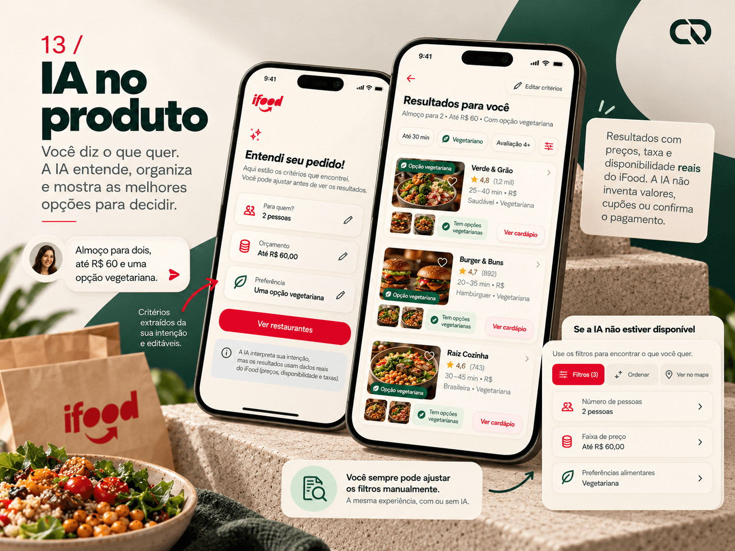
One evolution would allow an input such as “lunch for two, up to R$60, with a vegetarian option”. The proposal does not treat an assistant as something entirely new: Ailo is already a public reference for AI at iFood. The interest lies in connecting intent to the shared plan.
Separating interpretation from decision
The model would extract participants, budget and preference. These criteria would be shown for confirmation and editing before querying the catalog and fees. Ranking would need verifiable data; the model would not invent prices, availability, coupons or timing, nor would it confirm payments.
Planning for ambiguity and failure
If the intent is unclear, the system asks. If AI is unavailable, the same filters remain manually accessible. This layer has not yet been integrated into the prototype: before a pilot, criterion extraction, error handling and behavior with real data would need to be assessed.
The proposal gets stronger when it can be questioned.
Observing understanding before measuring impact
Testing the experience's reasoning
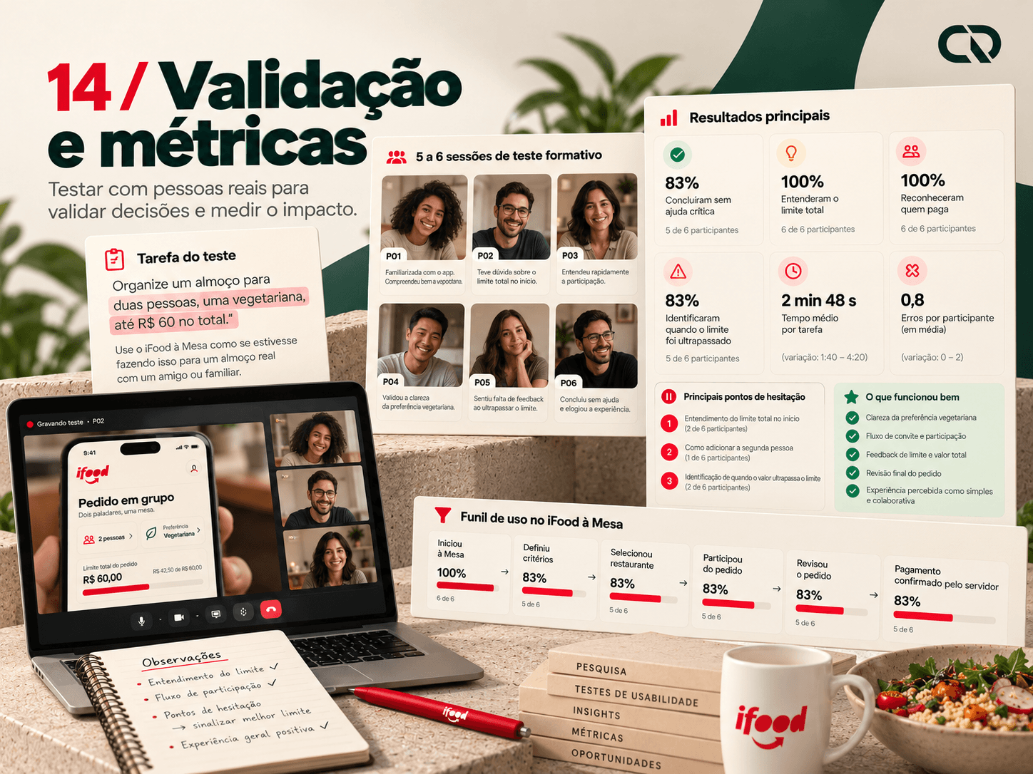
The next cycle proposes 5 to 6 formative sessions. The task is to organize lunch for two people, one vegetarian, for up to R$60 in total. Comparison, entry through an invitation and a fee change should appear without the moderator pointing out the paths.
Observing what matters
Completing the task without critical help is only part of the evaluation. The person needs to explain the total, recognize who pays, notice when the budget is exceeded and find editing and help. Errors, task time and moments of hesitation should be linked to specific interface decisions to guide iteration.
Preparing a product evaluation
In a pilot, the funnel would track table creation, criteria, selection, participation, review and server-confirmed payment. Completion and revisions would be analyzed alongside cancellations and billing questions. Targets and an experiment would depend on a baseline and comparable journeys; this delivery includes no participant testing or measured business gain.
A journey built from connected decisions.
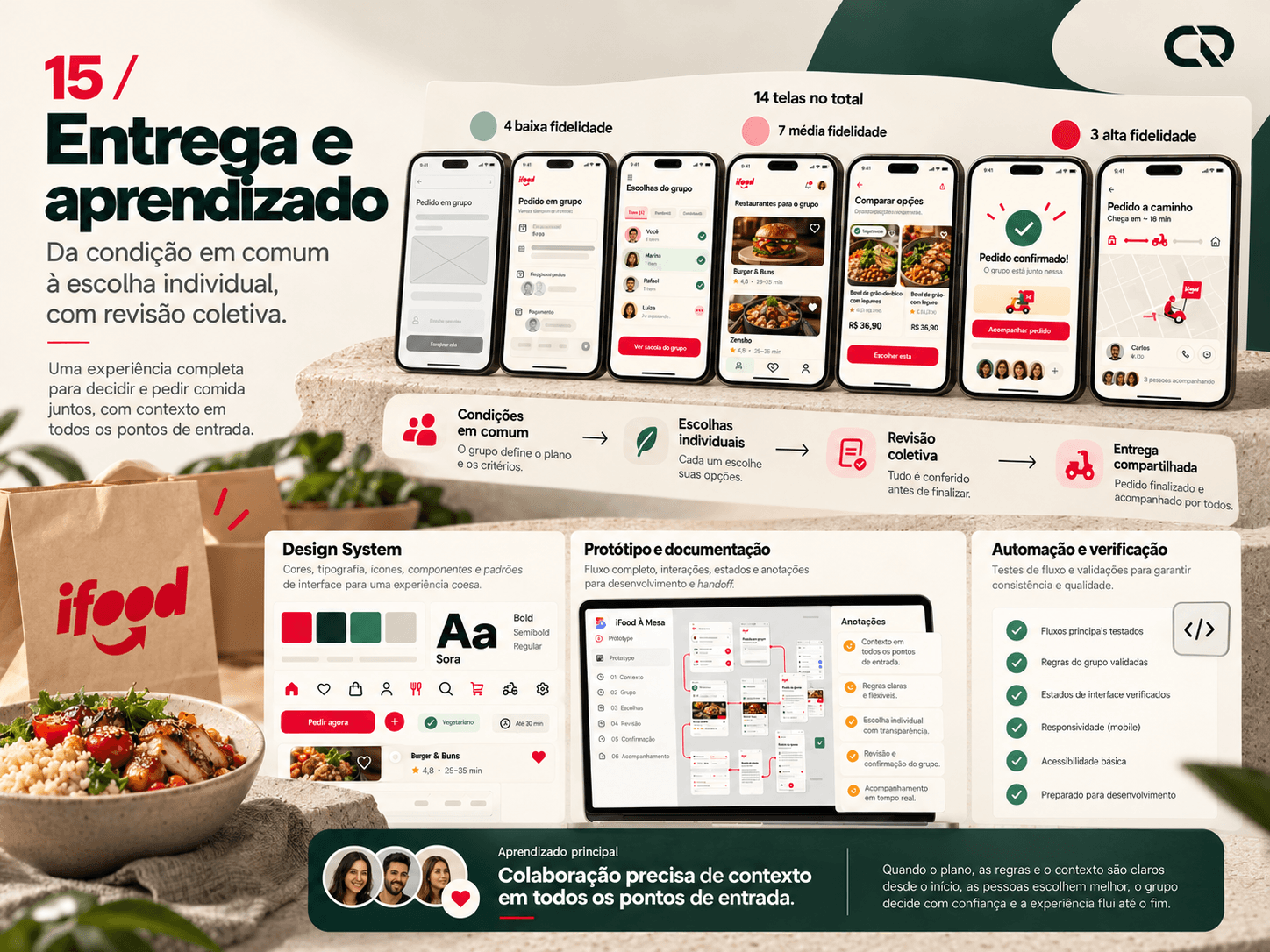
Screens across three fidelity levels. A design deliverable, not an impact metric.
The project brings together 14 screens across three fidelity levels, a conceptual Design System, an offline prototype, documentation and automation. The proposal connects the table’s conditions, individual selection and collective review. Understanding the total and reducing coordination are objectives to test, not results already achieved.
The learning that guides the next step
The main reflection is that collaboration requires context at every entry point in the journey. Bringing dishes together in a basket is not enough: participants need to understand the conditions, and the person paying needs to recognize the commitment. The next step is to observe these behaviors, revisit the hypotheses and deepen implementation with design and technology.