

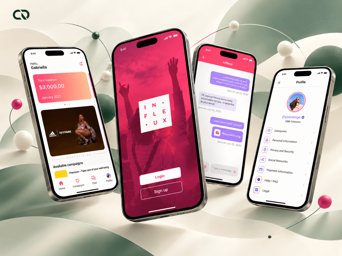
From opportunity to participation: designing the creator's everyday work.
A campaign takes more than finding an opportunity. Creators need to understand the conditions, prepare their participation and resolve questions along the way. At Infleux, I worked to connect these moments in an app built from an existing web app.
As the company's only designer, I led internal research, information architecture, flows, interface design and UX writing, working with technology and stakeholders. The project brought campaigns, profiles and communication to mobile, preserving the product's identity while revisiting what needed to change in the interaction.
My contribution: turning insights from operations and business objectives into experience decisions, from the first sign-up to campaign execution.
The app needed to support creators between campaigns.
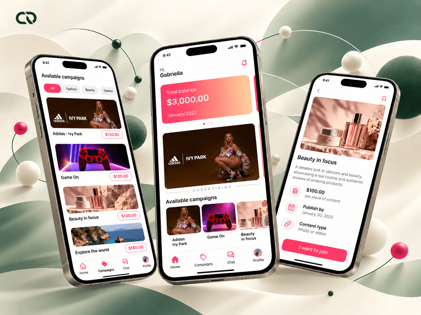
When I joined Infleux, the company already had a web app and an established design system. I took over UX work after the previous designer left, collaborating with development while also improving internal systems.
The company wanted an app to notify creators about new campaigns. Communication difficulties, however, suggested a broader need: supporting the work after an opportunity opened. Instructions needed to be understood, and questions needed a path to an answer.
Some web app components also had problems on phones. I therefore used the useful features as a starting point and revised their organization and behavior for mobile. The challenge combined product continuity, clear tasks and a closer connection with creators.
I started with the people who handled questions every day.
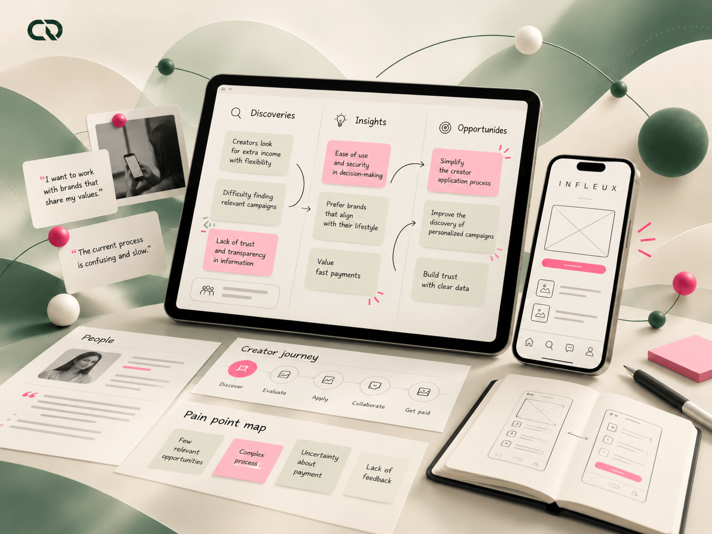
I spoke with the professionals who were in frequent contact with creators. Support, customer service and operations helped identify sign-up difficulties, recurring questions and points where communication required further explanation. This was the access available to the audience's experience at that time.
In parallel, I listened to stakeholders, the CEO and investors to understand what they expected from the app. I kept these perspectives distinct in the project's reasoning: one helped me understand the work of campaign participants; the other clarified business priorities and expectations.
This understanding led to concrete areas of work: guiding entry into the platform, organizing access to campaigns and bringing communication closer to the activity. I also consulted national and international product references and mobile patterns to explore ways of solving these interactions.
The research gave the scope direction: the app needed to sustain participation as well as announce new opportunities.
The CSD matrix helped turn expectations into product questions.
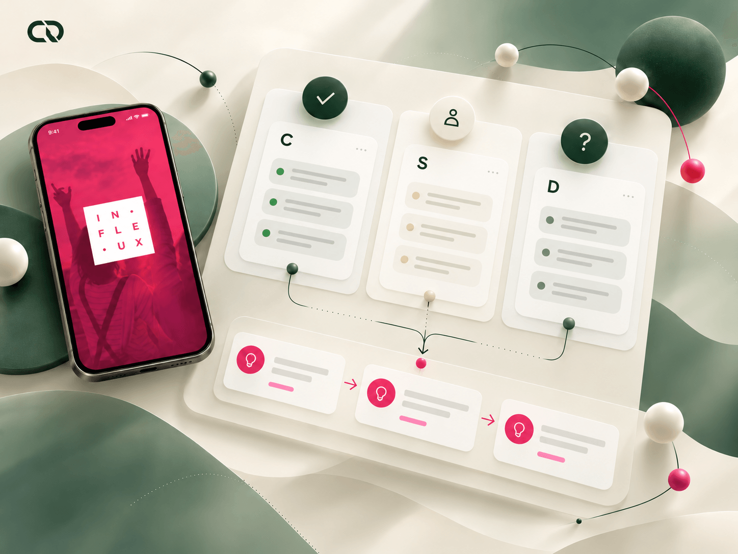
I organized the initial understanding in a CSD matrix and facilitated alignment with the team. Its purpose was to separate what we already knew about the product, what we expected from the app and what still needed clarification. This created a common foundation for discussing the initial scope.
Communication and navigation difficulties informed a direction: bringing opportunity, guidance and conversation closer together could create more continuity in the journey. This relationship guided choices without turning every request into a new feature.
Prioritization meant preserving the useful web app features and focusing the app on creators' tasks. Sign-up, profiles, campaigns and communication were discussed alongside technical feasibility. The launch was built around this scope.
Decision criterion: every part of the experience should help people enter, understand, participate or follow up.
Organizing the path before detailing the screens.
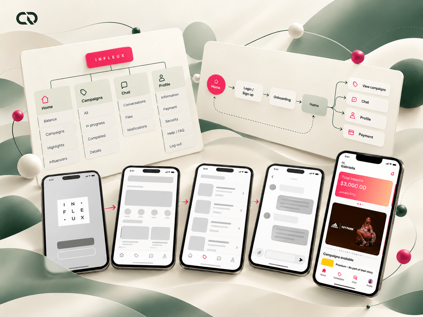
Through internal card sorting, I worked on content groupings to revisit navigation. Campaigns, chat and help needed recognizable purposes: finding an opportunity, discussing it and checking guidance are related but different needs.
Navigable wireframes
I took that organization into navigable wireframes. The sequence connecting sign-up, profiles, campaign exploration and conversation allowed us to discuss the product as a journey. The team could evaluate where a task began, what information it required and how someone would continue.
Alignment with development
Discussions with development refined the flows before the final interface. Navigation, available components and rules needed to work together. A change in sign-up, for example, affected field states, messages and the continuity of the interaction.
The benefit of this stage was making decisions tangible for discussion: the structure showed relationships between tasks that a collection of isolated screens could not explain.
Understanding the brief and resolving questions in the same context.
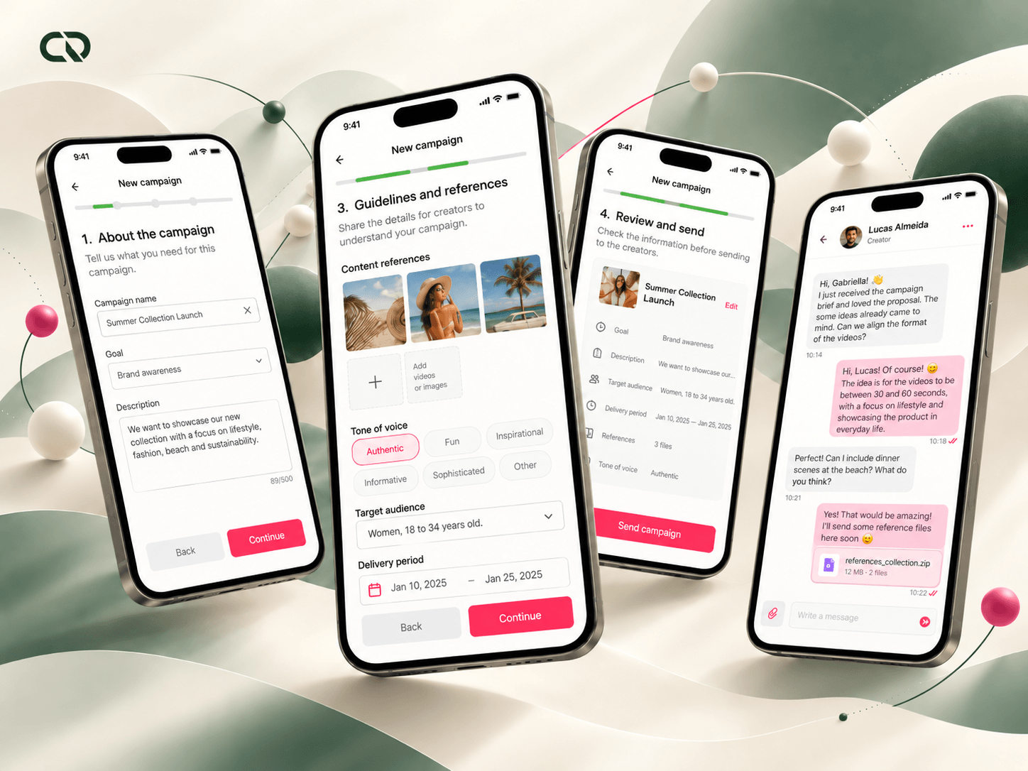
I proposed bringing conversation into the app, with a familiar feel similar to a chat app like WhatsApp. The team could share documents, images, briefs and information with creators. The feature's role was to support campaign execution by bringing guidance closer to the activity.
The brief was organized into seven stages. Instead of relying on a long read without clear progression, people moved through a sequence to understand the conditions before continuing with participation. The decision needed to balance required content with reading effort.
These two areas complemented each other: the brief structured information common to the campaign; chat provided a space for any remaining questions. The experience gained paths for both planned guidance and situations that required a conversation.
Participation requires understanding. That relationship guided the design of information, next steps and communication.
Entry requirements also needed to be understandable.
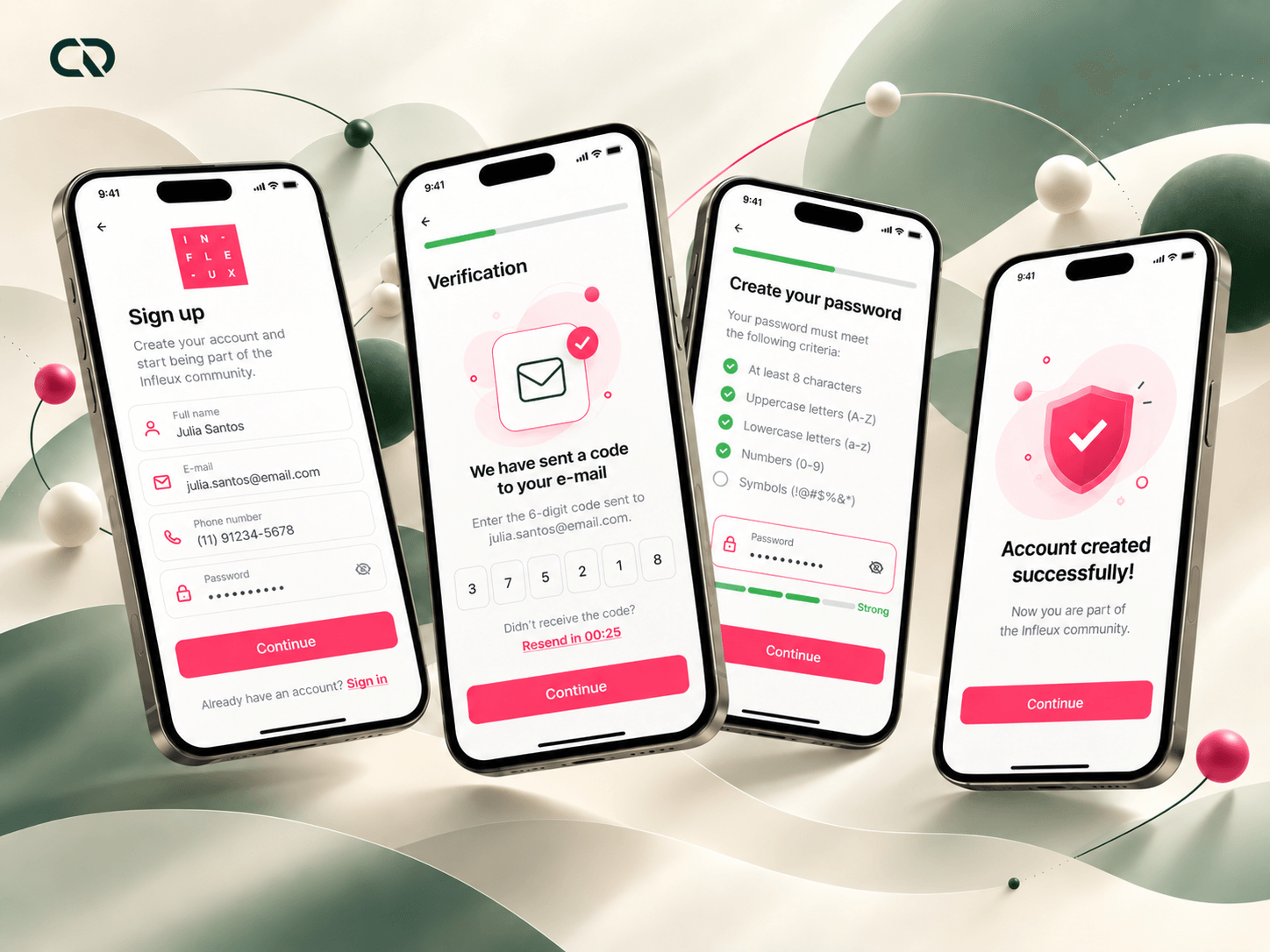
Questions about sign-up and validation made this entry point an important part of the project. I worked on SMS and email confirmation, password requirements and validation states alongside the copy guiding people through the fields.
In the interface records, the password is shown with its requirements and different feedback states. People can relate what they have typed to what is still required. The rule is no longer only a message received after an attempt.
UX writing followed the interaction: explaining the request, identifying the error and indicating how to continue were part of the same task. My concern was that validation requirements came with enough guidance for people to proceed.
The delivery was concrete: an entry flow with confirmations, visible requirements and messages connected to actions.
Care for the experience showed up in small choices.
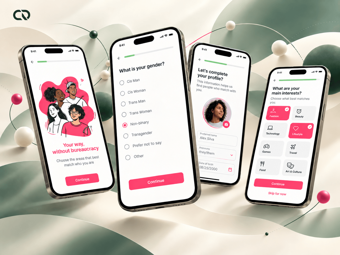
I revised copy to bring the language closer to creators' everyday work and explain actions more clearly. Introductory messages, fields and feedback needed to form a coherent conversation, rather than changing tone at every stage.
The gender field was also revised to broaden the identification options. I consulted practices from products such as Google and Facebook to support that decision. Sign-up needed to recognize the diversity of people using the platform and give them room to represent themselves.
For profiles, I worked on personal information, photography and connections to social networks, including Instagram and Facebook. This information connected sign-up with creators' professional work and their presence in campaigns.
Copy, forms and profiles were parts of the same problem: helping someone enter the product, understand what was being requested and present themselves within it.
Preserving the brand while revisiting behavior on mobile.
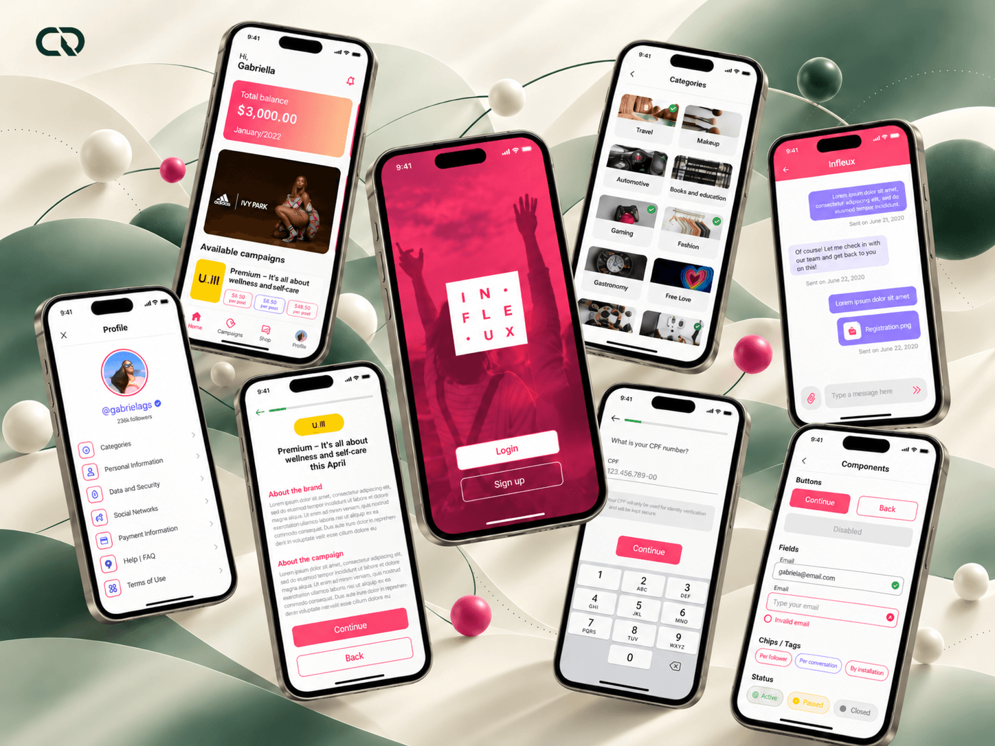
A foundation for the app
The existing design system provided a foundation for identity and consistency. My contribution was to evolve it for the app, adapting components and creating the additions needed for mobile use.
Mobile behavior
I revisited hierarchy, fields, feedback and navigation, especially where the web app experience had problems on phones. Preserving brand recognition also required attention to behavior: the keyboard takes up space, fields have states and actions need to remain understandable during completion.
Shared components
This work took place in collaboration with development, connecting interface proposals with implementation. Reusable components helped bring the same decisions to different points in the journey, from sign-up to campaigns.
Consistency came from the combination: a preserved visual identity, shared interaction patterns and guidance aligned with the context of each task.
The project brought the parts of participation together in a mobile product.
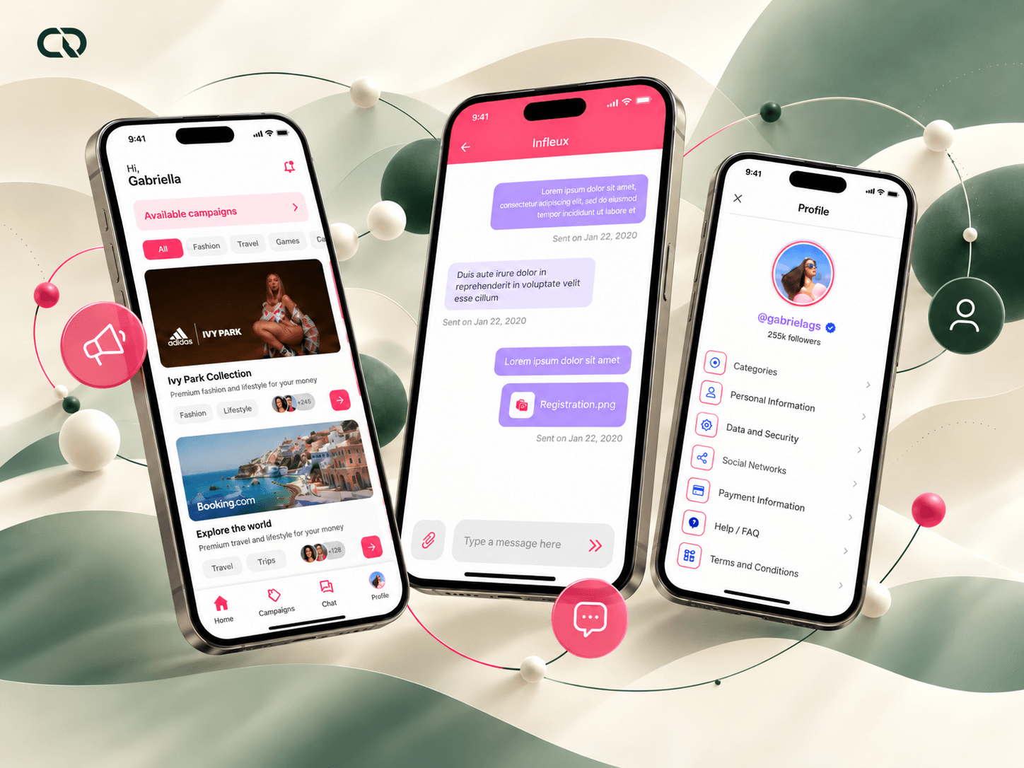
The app brought access to campaigns, profiles, sign-up and communication features together in a mobile experience. Creators gained a place to find opportunities, consult guidance and stay in touch with the team.
This delivery resulted from a connected series of decisions. Insights from operations guided the scope; the CSD matrix supported alignment; content groupings and wireframes organized the path; briefs, chat, sign-up and components shaped the interactions.
As the only designer, I connected these areas and worked with technology to make them feasible. The launch took place in 120 days, alongside work that also included improvements to internal systems.
The project's value lies in that connection: the mobile adaptation came to consider the whole process from discovering a campaign to being able to participate in it.
A delivery that became part of the operation.
The immediate result was the launch of a mobile experience connecting campaigns, guidance and communication. The work also left detailed entry flows, broader identification options and components prepared for the app.
Android downloads
The cumulative download range reported by Google Play for the Infleux app. Accessed October 13, 2026.
available in both stores
The public Google Play and App Store pages confirm the product's availability.
The scale of the business this experience supports
creators in Infleux's network in October 2026
Infleux currently reports a network of more than 70,000 creators and more than 700 partner brands. These figures describe the company's operation in October 2026; the download count represents the app's cumulative reach.
My contribution was to build the mobile foundation for this journey in collaboration with the team. For me, this project consolidated a way of working: listening to operations, making decisions explicit and taking care of continuity between tasks. Experience quality is built both in navigation structure and in the detail that explains how to continue.